Let’s be honest… Not everyone gets excited at the idea of reading pages of convoluted data or spreadsheets containing thousands of numbers. They can be complicated, time-consuming, and quite frankly, boring. Cool and fascinating charts – now that’s a different story. They’re like the drive-throughs of information. No need to dress up and sit through long courses, just grab your takeaway and go.
Well-designed charts have the ability to turn mountains of research into easily consumable, and sometimes entertaining, information. They explain in seconds what could take dozens of pages to describe. And nowadays, they cover everything under the sun. Some reveal intriguing trends we didn’t realize were happening, others answer questions we didn’t know we had.
Every now and again, Bored Panda puts together a compilation of the most interesting charts out there. And today we’re doing just that… From the world’s happiest cities, to how many hours of work are needed in different countries to escape poverty, keep scrolling if you want understand the bigger picture at a glance.
#1 A Cool Guide On How To Get Out Of Poverty Depending On Where You Reside
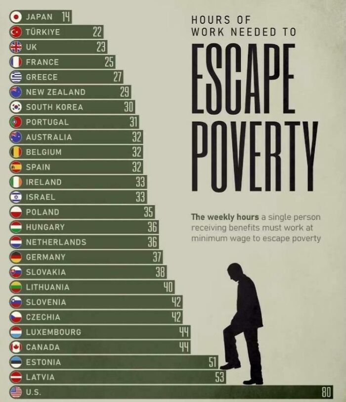
© Photo: Aubreykubheka
#2 A Map Of Every Place Where Ancient Roman Coin Hoards Have Been Found
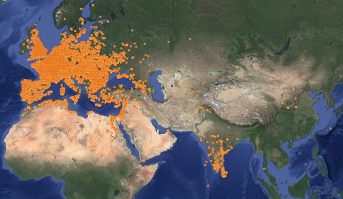
© Photo: brilliantmaps.com
#3 Countries That Do Not Allow Wild Animals In Circuses
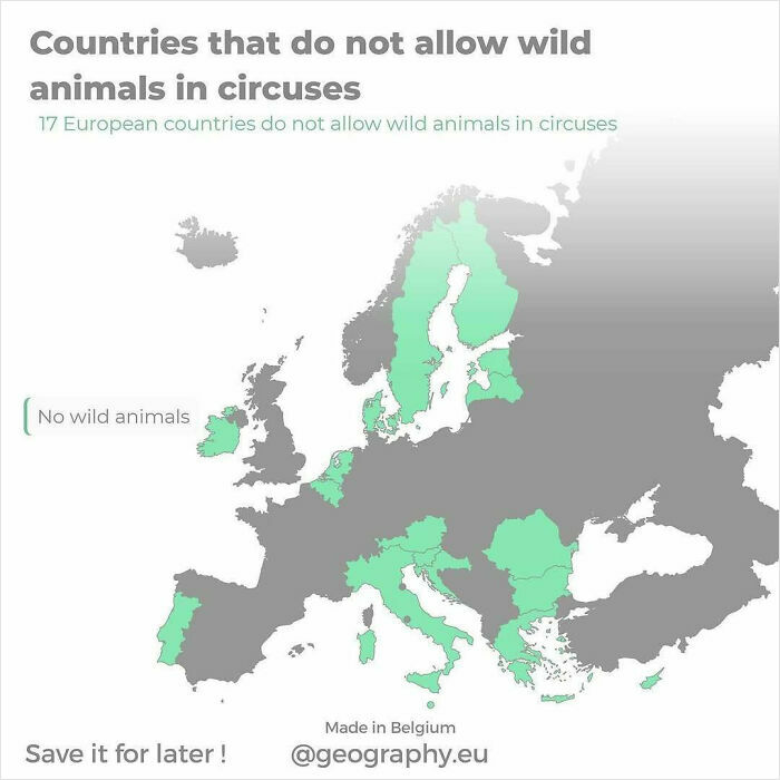
© Photo: geography.eu
When it comes to charts, a picture can often speak more than a thousand words. Quite literally. And nowadays, whatever information you’re looking for, whether it be election results, the world’s happiest cities, sports statistics, or even how many cups of coffee people drink in any given week, there’s probably a chart for that.
Were it not for useful charts, we’d need to get important data and information from spreadsheets with endless numbers, or possibly hundreds of pages of stats and words. It can get boring, tiring and overwhelming. Charts turn complicated data into easily digestible visual information that our brains can better manage. They’re often informative, educational, interesting and easy on the eye.
#4 Film Genre Popularity 1910-2021
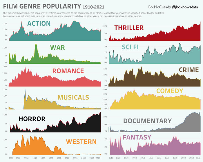
© Photo: BoMcCready
#5 The World’s Oldest Universities
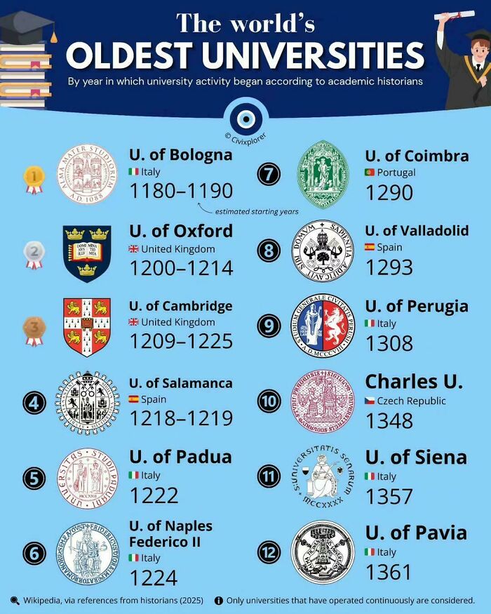
© Photo: vladgrinch
#6 World’s Fastest Train
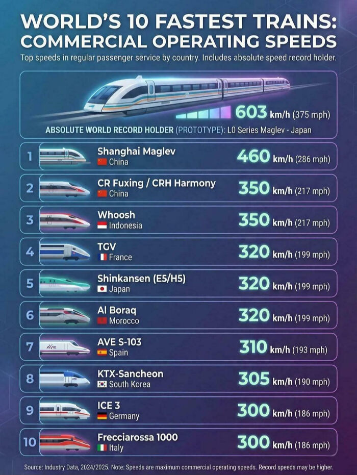
© Photo: AdministrativePool93
Charts are one of the most powerful communication tools available. They make trends, comparisons, relationships, and useful information pop almost instantly. That’s because human beings are visual creatures. Our brains process pictures and visual information more efficiently and faster than a whole bunch of words. We naturally pick up shapes, patterns, symbols and/or changes in a graph.
#7 The Most Powerful Passports In 2025
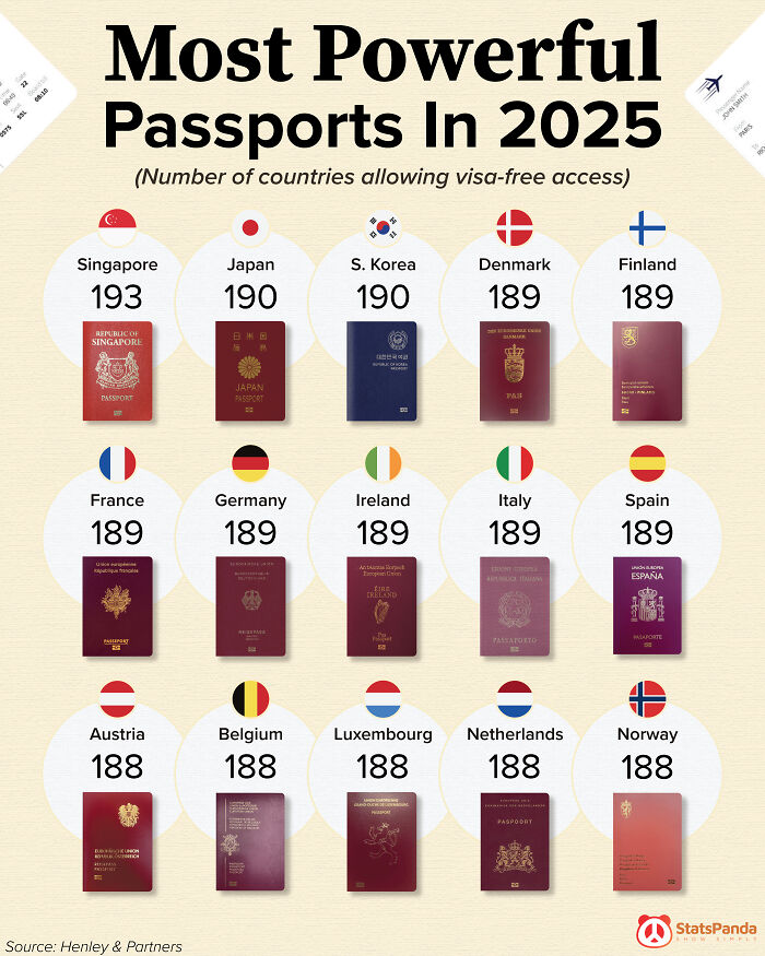
© Photo: StatsPanda
#8 AI Sources
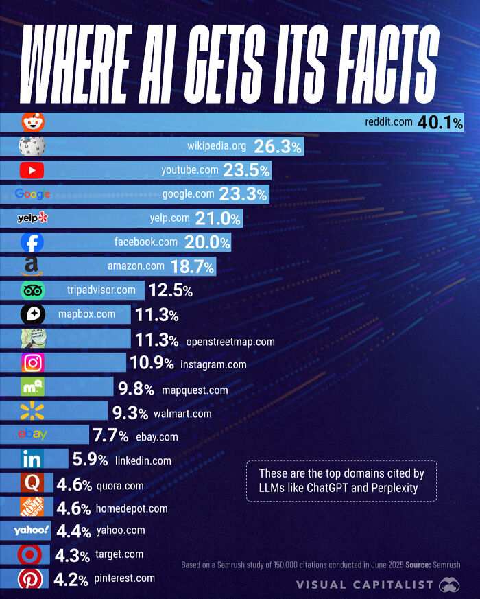
© Photo: Marcus Lu
#9 The World’s Happiest Cities In 2026
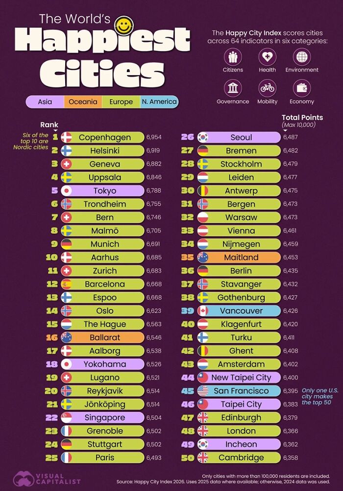
© Photo: visual capitalist
“Not everyone has the skill or interest required to dig deep into the numbers and pull out relevant trends, but anyone can look at a chart or graph and understand how different elements compare, or contrast, giving them an instant understanding of what the visualization seeks to convey,” explains the team at ThoughtSpot, an agentic analytics platform.
#10 Comparing The World’s Tallest Statue Next To Other Notable Statues
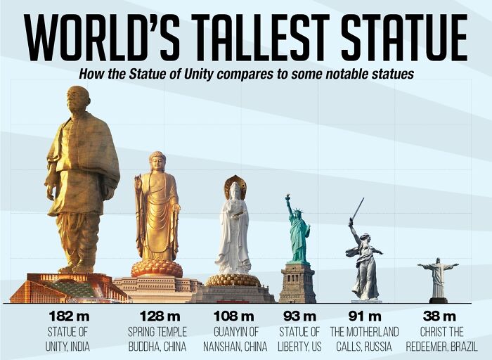
© Photo: malgoya
#11 Pizza Consumption Per Person Per Year
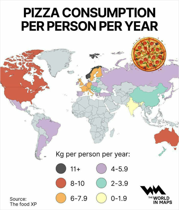
© Photo: vladgrinch
#12 Why Young Adults Are Saying No To Parenthood

© Photo: Yodest_Data
We live in a fast-paced digital world with almost too much information available at our fingertips. Businesses track sales and performances, governments monitor populations and crime rates, scientists analyze experiments and studies, and websites collect millions of user interactions on a daily basis.
Without graphs and charts all of this valuable data could easily be impossible to digest.
#13 Countries With The Most Unesco Sites
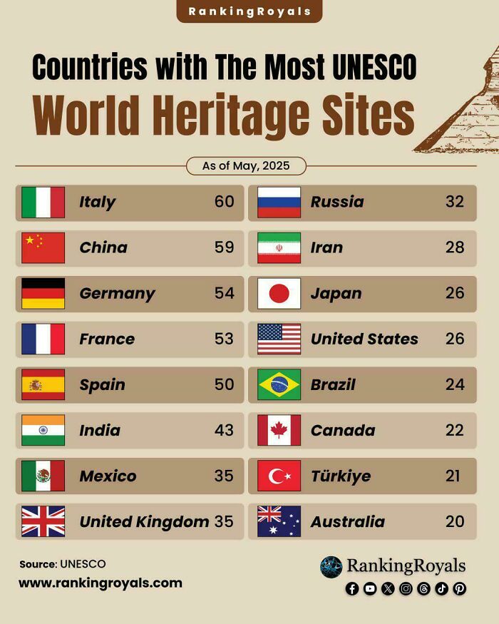
© Photo: User
#14 In The EU, The Mean Age Of Women At The Birth Of Their First Child Was 29.9 Years In 2024
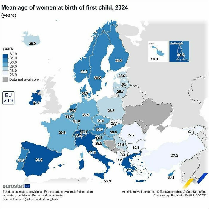
© Photo: eu_eurostat
#15 A Cool Guide To Region Wise Calling Codes
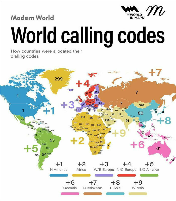
© Photo: maven.mapping
The best charts are often the ones that allow audiences with different levels of expertise to understand the same information.
“The aim is to tell a good story by translating the data into a form that is easy to understand for everyone,” notes Deloitte’s site. “Useful information is highlighted and the noise is eliminated from the data.”
And that’s the point: to tell a good story. If a chart is designed poorly, it can create more confusion than clarity.
#16 Young Adult Happiness Declining
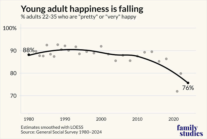
© Photo: grantjbailey
#17 Young Americans Believe Wealth Comes From Exploitation; Older Americans Believe Wealth Is Earned
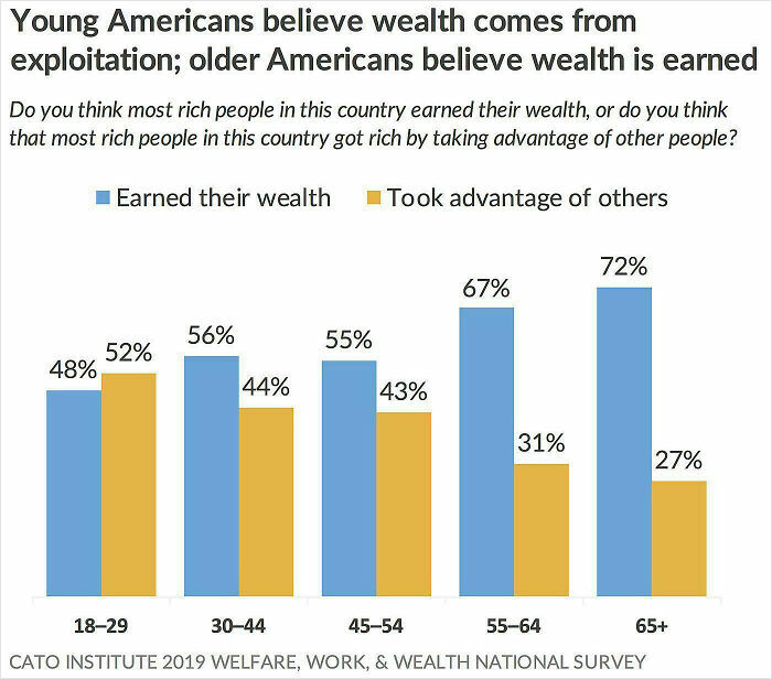
© Photo: Miserable_Coyote_279
#18 Have You Ever Seen A Vulcano?
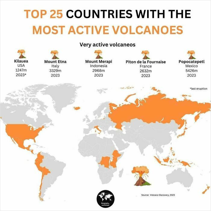
© Photo: geography_worldmaps
“When it comes to misleading data visualizations, pie charts are often the worst offenders,” reveals the GoodData.AI team, adding that sometimes pie charts just don’t cut it.
“When there are too many slices, a chart becomes cluttered, and the differences between segments are hard to distinguish,” they explain. “This overwhelms the viewer and diminishes the chart’s ability to communicate any meaningful insights.”
#19 Official Languages In South American Countries
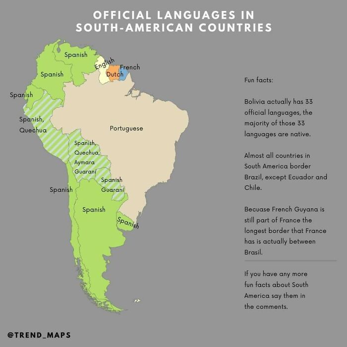
© Photo: trend_maps
#20 Euro Area Unemployment At 6.3%, EU At 6%
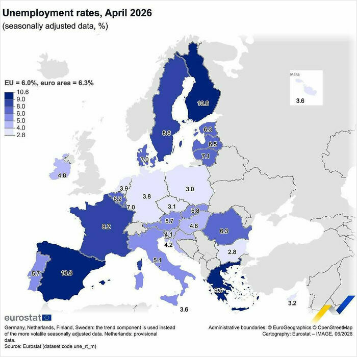
© Photo: eu_eurostat
#21 A Cool Guide Of Salary By Education Level In The US
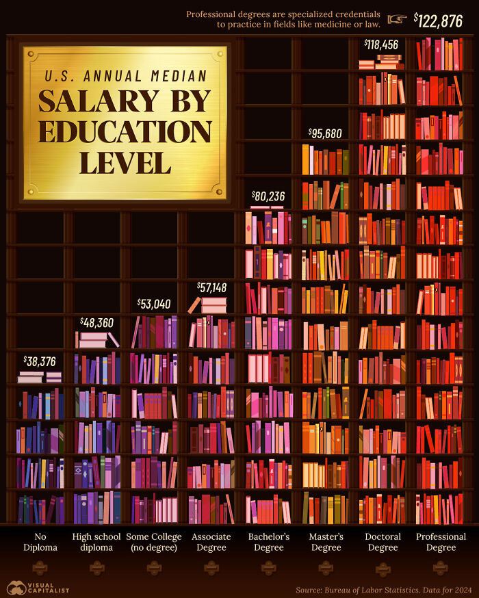
© Photo: Niccolo Conte
Another thing that can leave people scratching their head is the thoughtless use of color. If random colors are assigned as representations on a chart or graph, it can lead to chaos, clutter, confusion and a rainbow of nothingness. The colors themselves need to tell a good story. And sometimes, it’s okay to use just one color instead of a whole bunch.
“While the colors may create an aesthetically pleasing chart, they contribute nothing to our understanding of the data,” notes the GoodData.AI site. “In fact, instead of adding clarity, the colors create visual noise that detracts from the data’s message.”
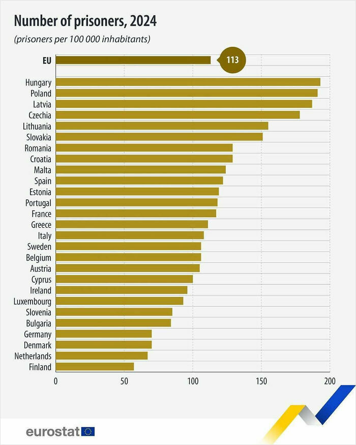
#22 In 2024, There Were 508 746 Prisoners In The EU, Indicating A 2.0% Increase Compared With 2023
© Photo: eu_eurostat
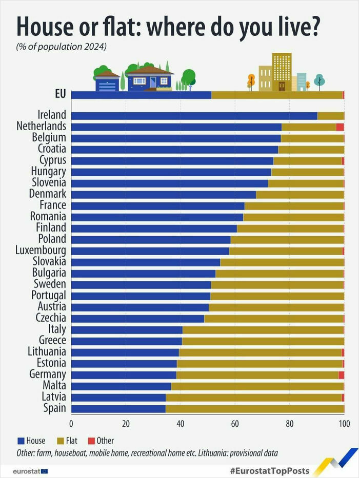
#23 In The EU In 2024, 51% Of The Population Lived In A House, While 48% Lived In A Flat (And 1% Lived In Other Accommodation, Such As Houseboats And Vans)
© Photo: eu_eurostat
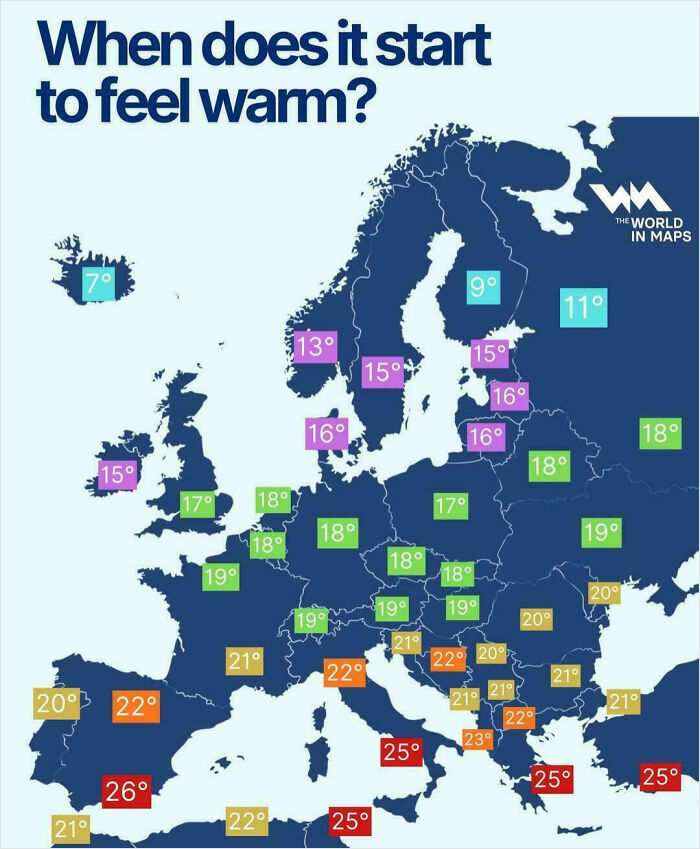
#24 When Does It Start To Feel Warm?
© Photo: vladgrinch
To create an effective chart, experts advise that you begin by identifying the story you want to tell (comparison, trend, distribution, or composition). “Then select a chart that naturally fits that purpose, like a line chart for trends over time or a bar chart for comparing categories,” adds the GoodData.AI team.
SEO copywriter, editor, and content strategist Rachel Nicholson, agrees. The expert reveals that before creating any data-based graphics, she ask herself: “Do I want to convince or clarify a point? Am I trying to visualize data that helped me solve a problem? Or am I trying to communicate a change that’s happening?”
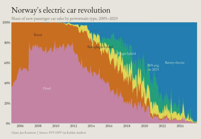
#25 Norway Has Gone From Near-Zero Sales Of Non‑emitting Battery Electric Vehicles To Now Close To 100% Of All New Passenger Car Sales
© Photo: Conscious-Quarter423
#26 In 2024, The EU Produced 50.8 Million Tonnes Of Potatoes.
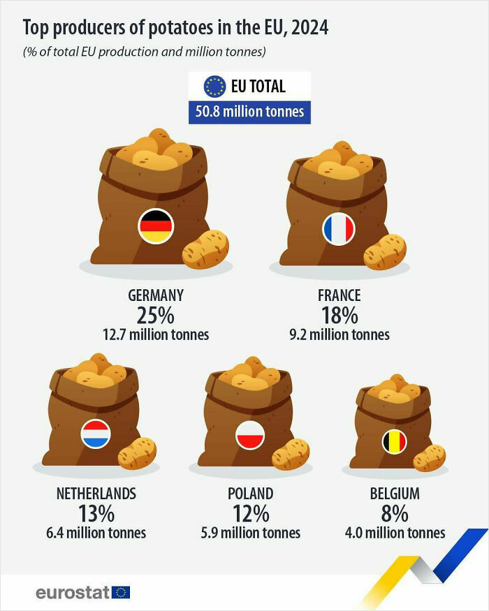
© Photo: eu_eurostat
#27 A Cool Guide On The World’s Most Spoken Languages
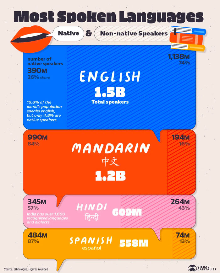
© Photo: Niccolo Conte
Nicholson says that if she’s trying to convince, she’ll probably opt for a pie or donut chart. But if she’s trying to communicate a change that’s happening, then it largely depends on the specific change.
“For tasks such as communicating a weekly schedule change or reallocating work between team members, I’ll use the Gantt chart,” Nicholson explains. “If I’m trying to show an internal change in marketing or sales trends over time, well, it’d likely be time to break out the bar graph.”
Either way, a chart or graph can help you get your point across a whole lot easier than a long email or massive spreadsheet containing an overwhelming amount of information.
#28 Generation Alpha’s Dream Careers, By Gender
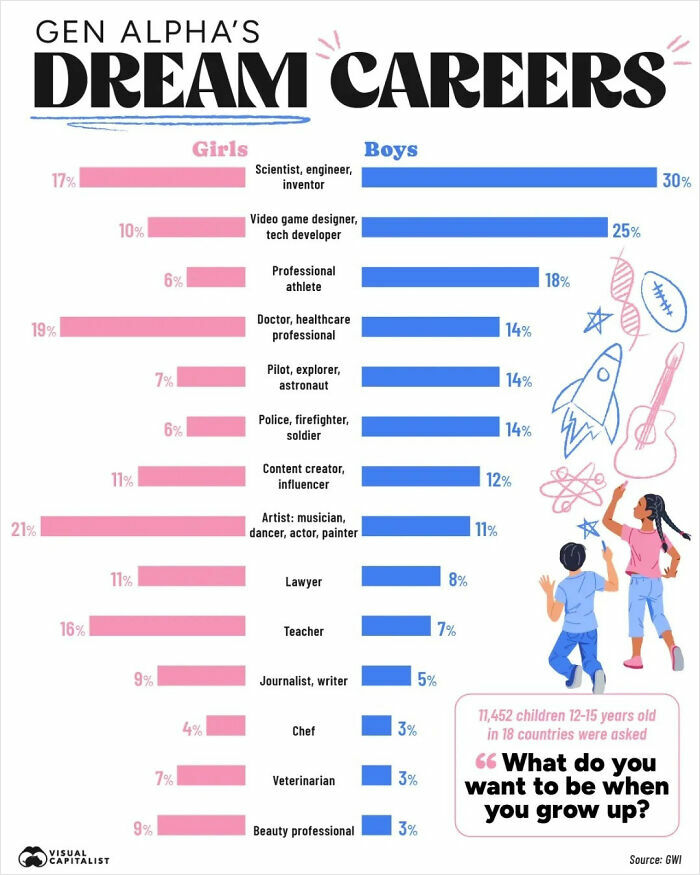
© Photo: Niccolo Conte
#29 Mobile Phone Brands By Market Share (2007 vs. 2025)
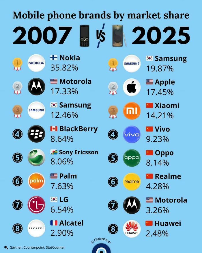
© Photo: vladgrinch
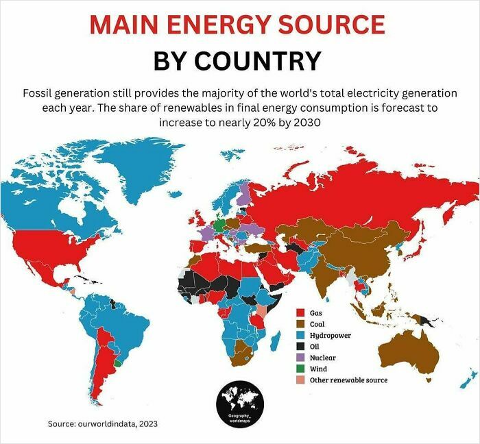
#30 What’s The Main Energy Source In Your Country?
© Photo: geography_worldmaps
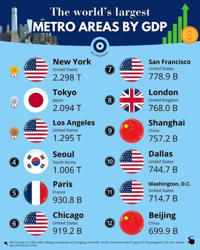
#31 The World’s Largest Metropolitan Economies By GDP
© Photo: vladgrinch
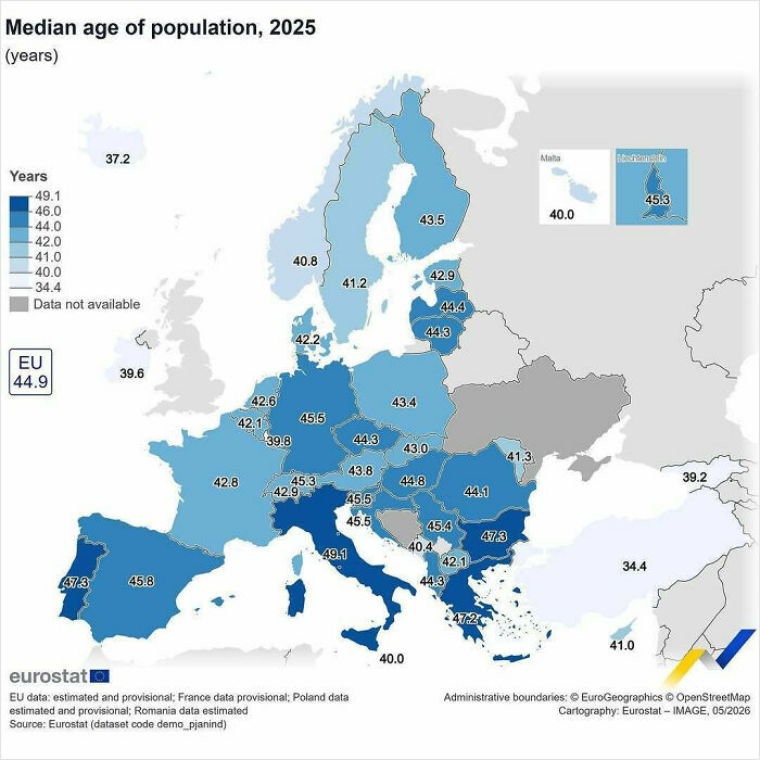
#32 In 2025, The Median Age Of Population In The EU Was 44.9 Years
© Photo: eu_eurostat
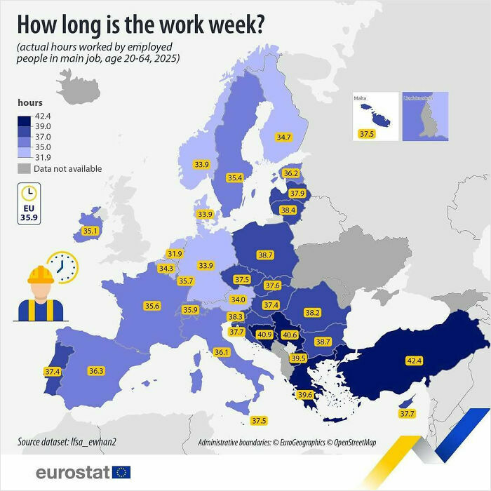
#33 In 2025, People In The EU Aged 20-64 Worked (Both Full And Part Time) An Average Of 35.9 Hours Per Week In Their Main Job
© Photo: eu_eurostat
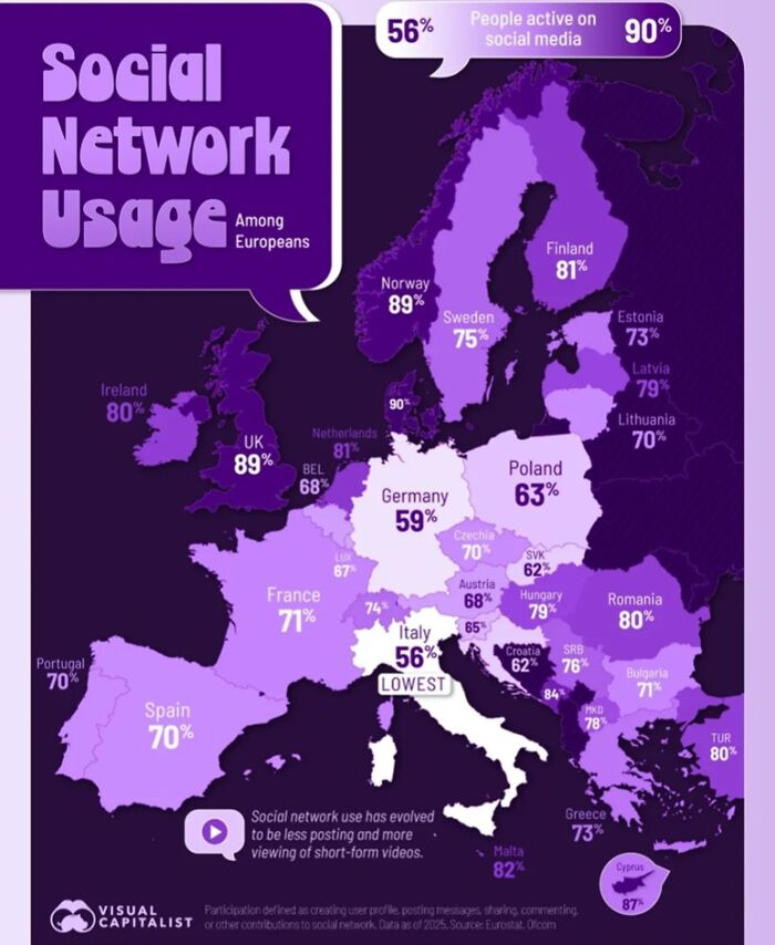
#34 Europe’s Social Media Gap By Country
© Photo: visual capitalist
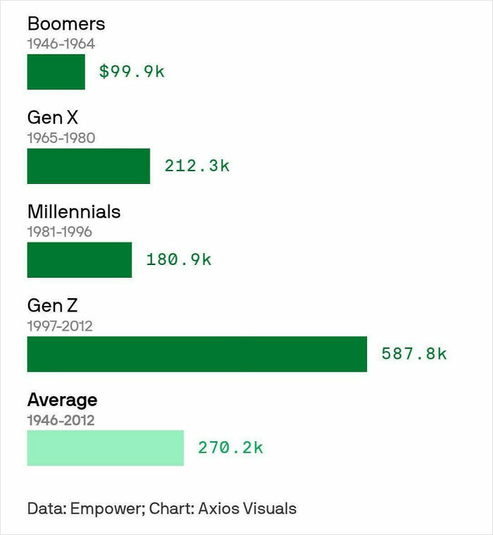
#35 Boomers Say It Takes $100k A Year To Be Financially Successful, Gen Z Says It Takes $600k
© Photo: Ben Berkowitz
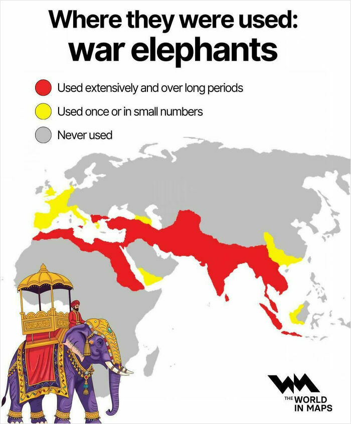
#36 Where War Elephants Were Once Used
© Photo: vladgrinch
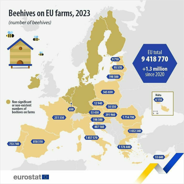
#37 There Were 9.4 Million Beehives On EU Farms In 2023
© Photo: eu_eurostat
#38 A Cool Guide To The US Most Visited Websites
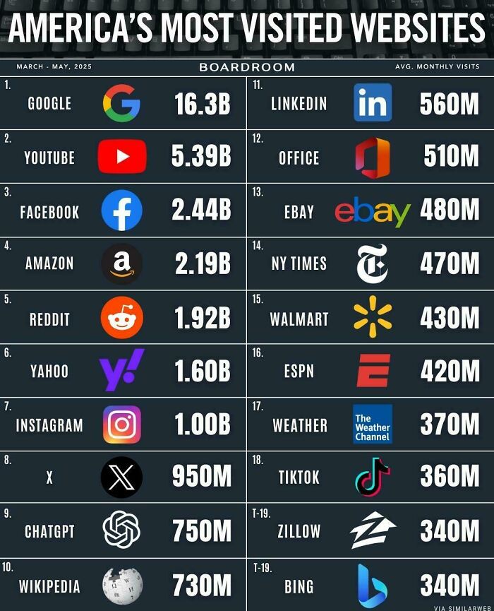
© Photo: User
#39 Adult Obesity Rates Across All 50 US States
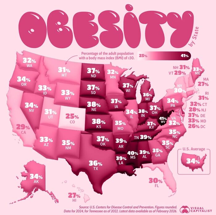
© Photo: visual capitalist
#40 World Cumulative Carbon Emissions Comparison
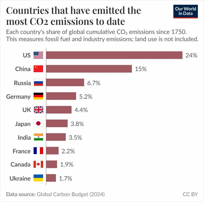
© Photo: OWiDCharts
#41 Highest Temperature Ever Recorded In Europe
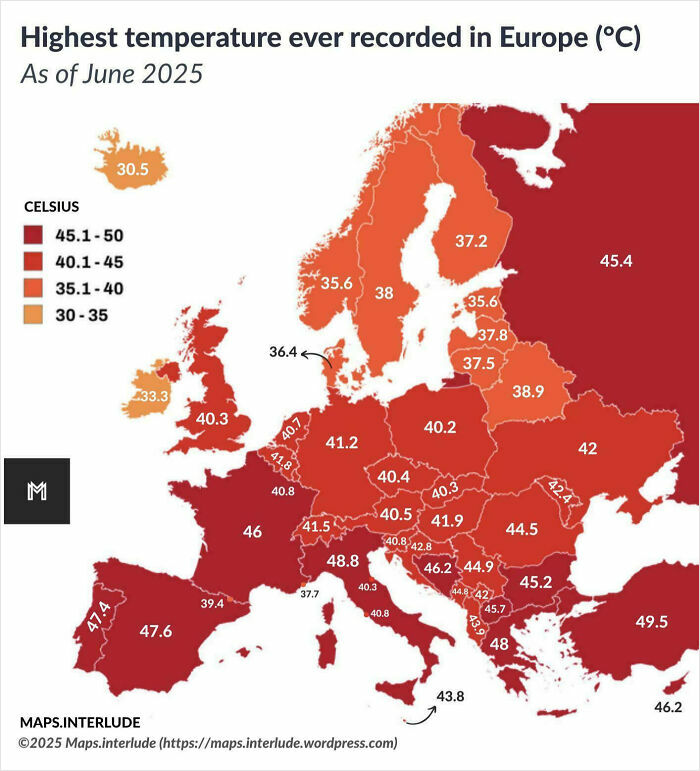
© Photo: quindiassomigli
#42 Honestly Surprising It Isn’t Higher
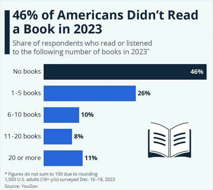
© Photo: Anna Fleck
#43 Ranking Of US States By Safety
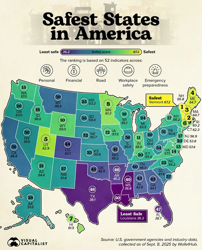
© Photo: Bruno Venditti
#44 Countries By The Share Of Babies Born Outside Of Marriage
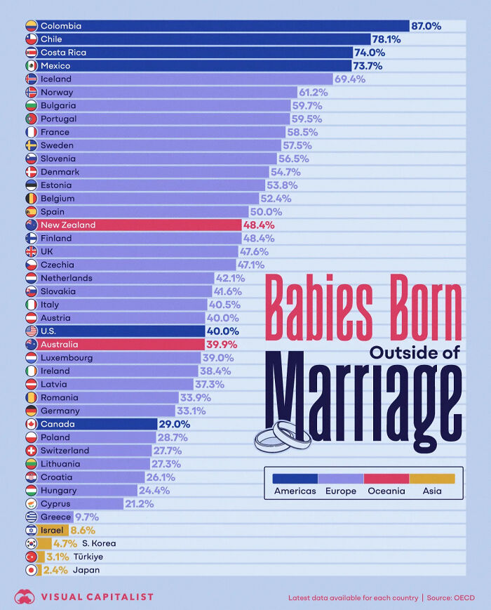
© Photo: Niccolo Conte
#45 The EU Produced 22.0 Million Tonnes Of Drinking Milk In 2024
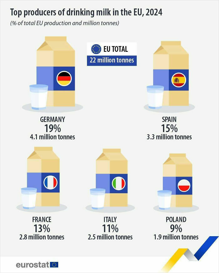
© Photo: eu_eurostat
#46 A Cool Guide To Top Universities Outside The US
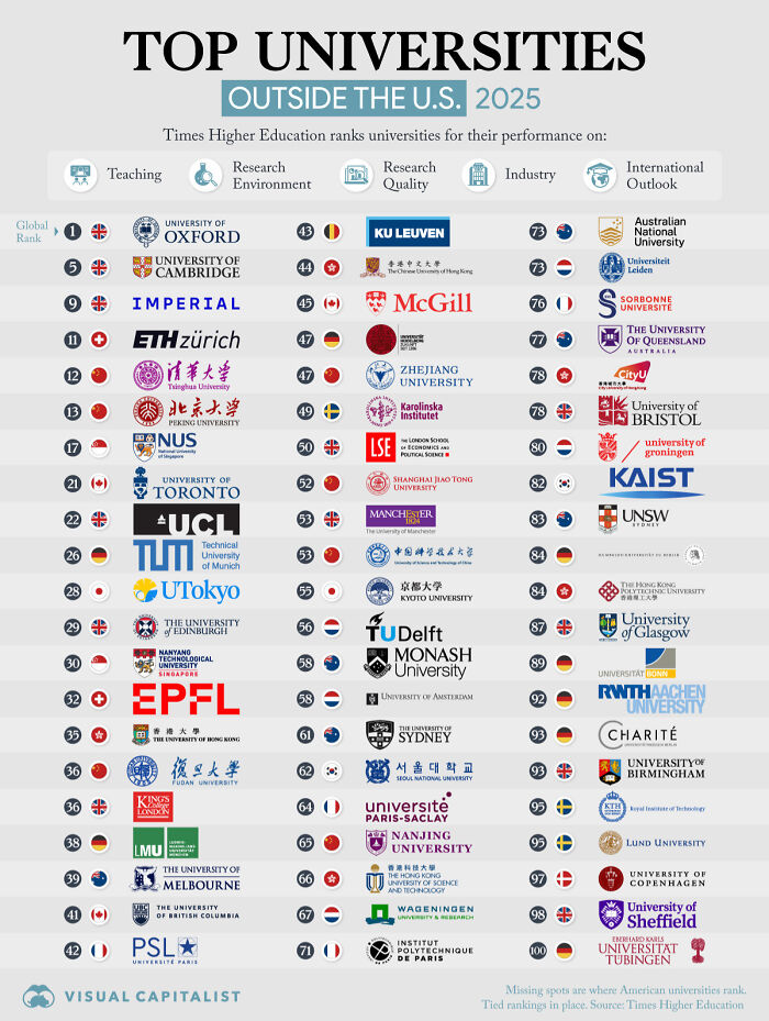
© Photo: Pallavi Rao
#47 A Cool Guide About Richest Pirates
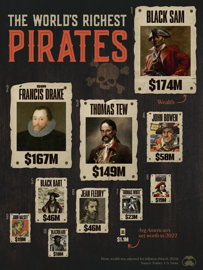
© Photo: visualcapitalist
#48 The 20 Worst College Degrees For Finding A Job
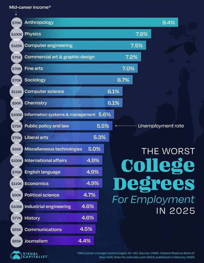
© Photo: Bruno Venditti
#49 A Cool Guide To Know Where Inflation Has Risen The Most In The US (2019-2025)
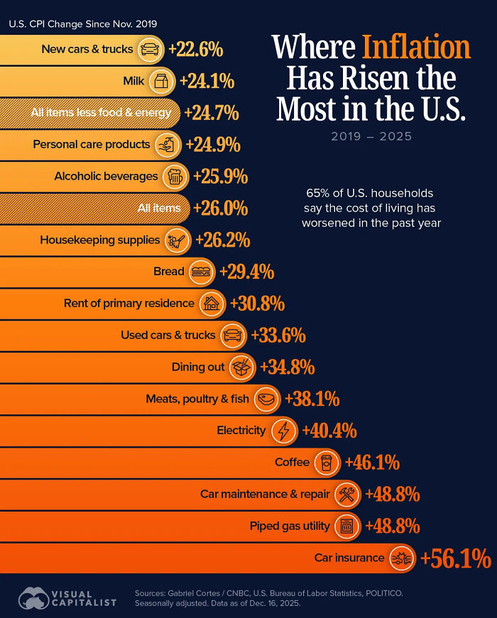
© Photo: Bruno Venditti
#50 The World’s Largest Employers 2024
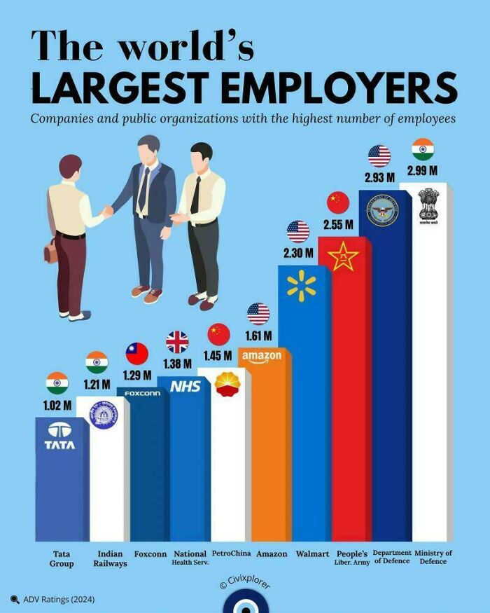
© Photo: RethinkerMind01
#51 Chances Of Being Born In Each Continent
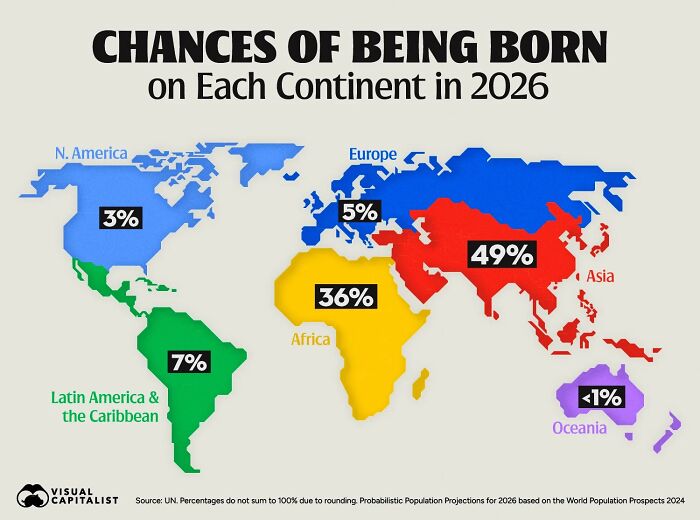
© Photo: Bruno Venditti
#52 Where Inflation Has Hit The Hardest (2000–2025)
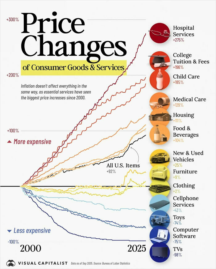
© Photo: Dorothy Neufeld
#53 Countries In Europe With A Metro
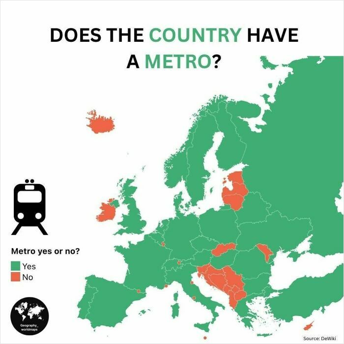
© Photo: geography_worldmaps
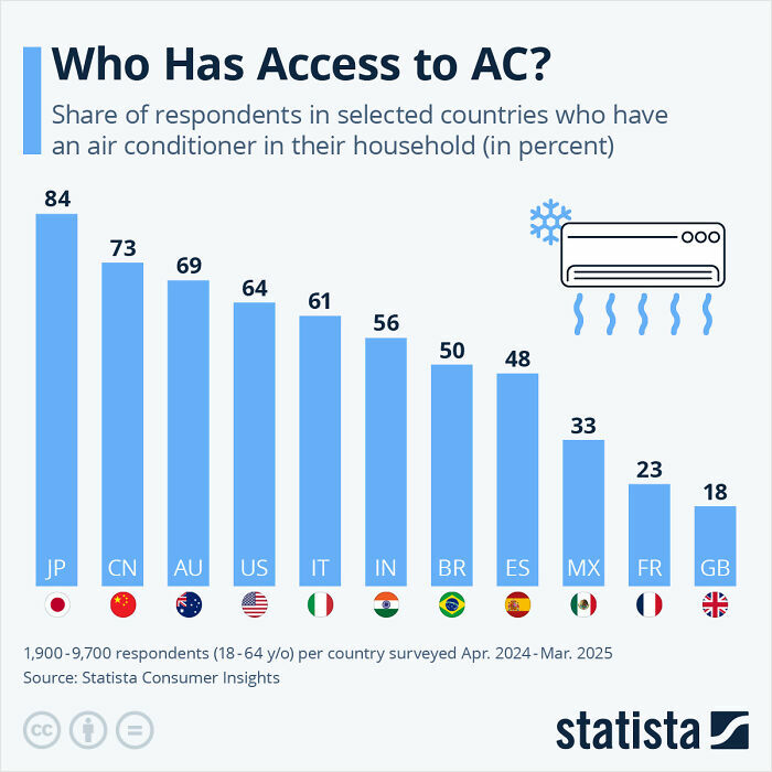
#54 Who Has Access To Air Conditioning?
© Photo: Anna Fleck
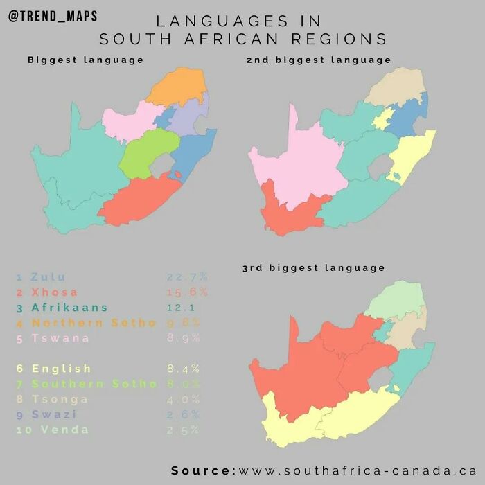
#55 Languages In South African Regions
© Photo: trend_maps
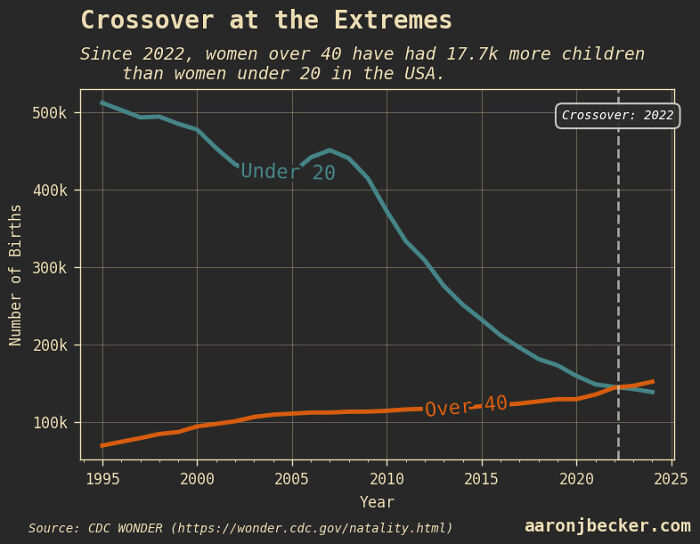
#56 Since 2022, Women Over 40 Have Had More Babies Than Women Under 20 In The USA
© Photo: aar0nbecker
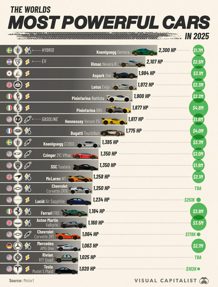
#57 2025 Most Powerful Cars vs. Cost
© Photo: Marcus Lu
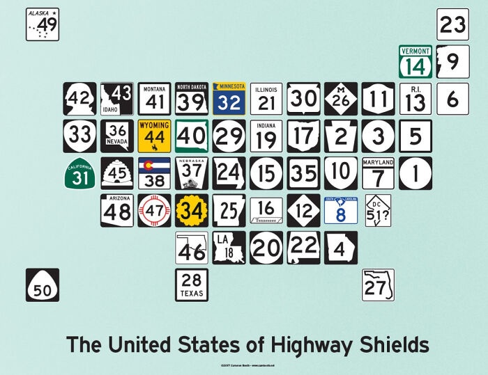
#58 The United States Of Highway Shields
© Photo: usefulcharts
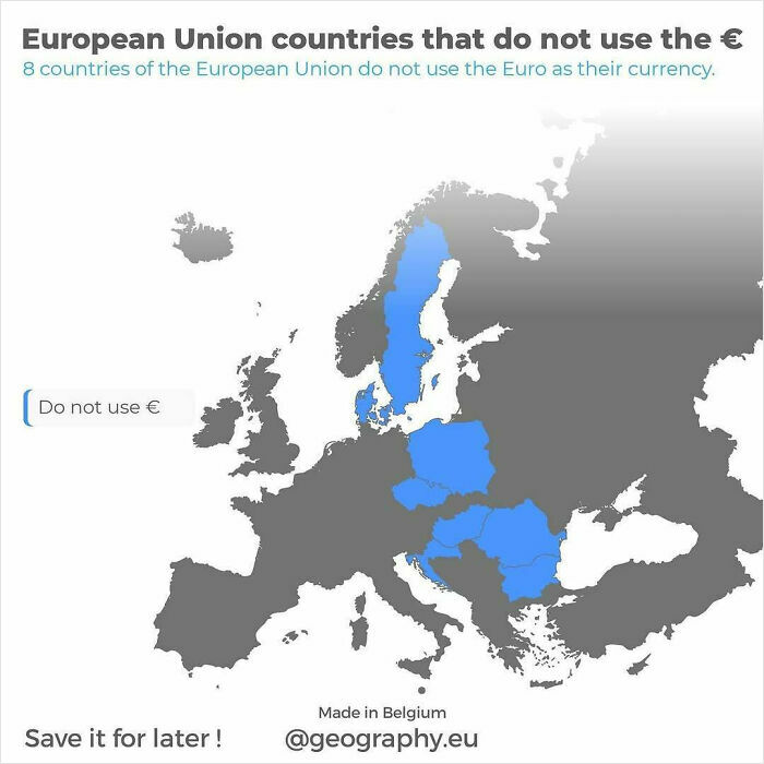
#59 European Union Countries That Do Not Use The Euro
© Photo: geography.eu
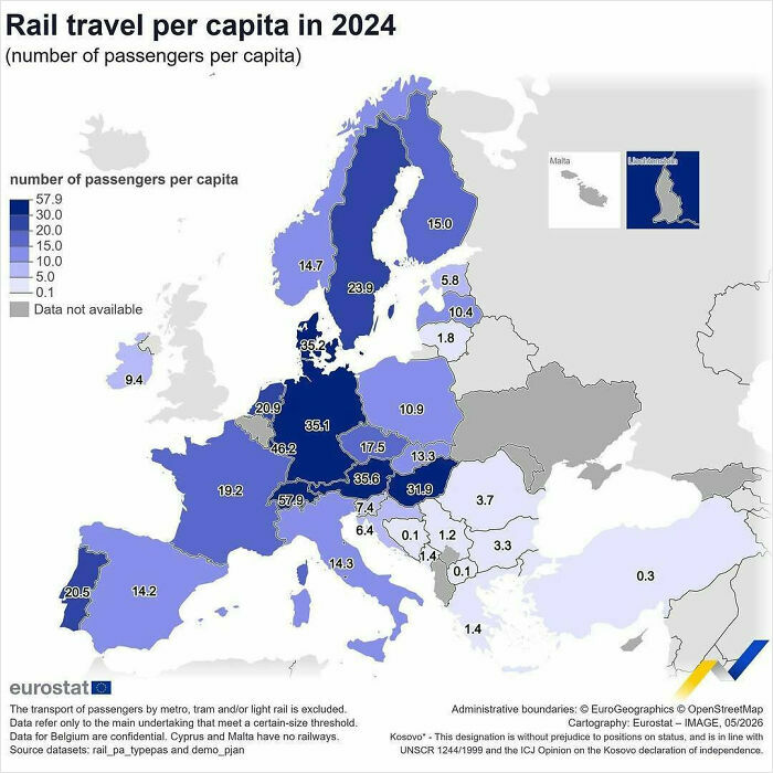
#60 Relative To Population, The Highest Ratio Of Rail Passengers Per Capita In The EU Countries In 2024 Was Recorded In Luxembourg, Austria And Denmark
© Photo: eu_eurostat
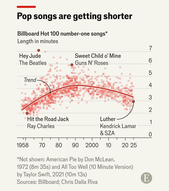
#61 A Cool Guide To Duration Of Songs Over Time
© Photo: User
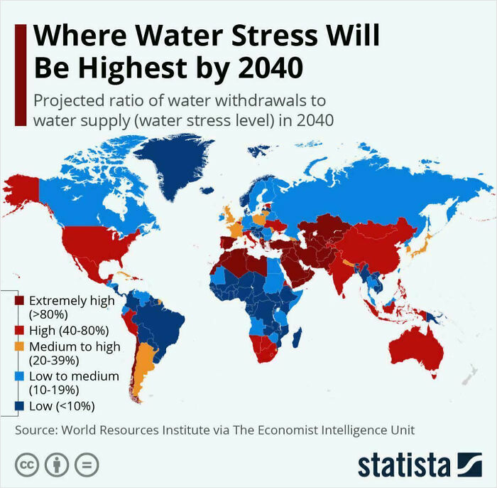
#62 Where Water Stress Will Be Highest By 2040
© Photo: reddit.com
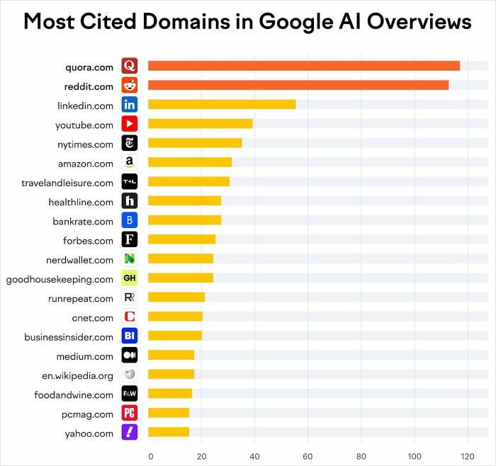
#63 Surprising That Reddit Is 2nd
© Photo: Rachel Handley
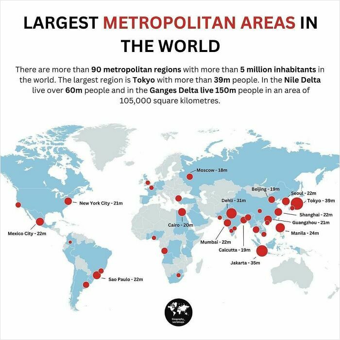
#64 Will The Earth Collapse One Day Because Of Too Many People?
© Photo: geography_worldmaps
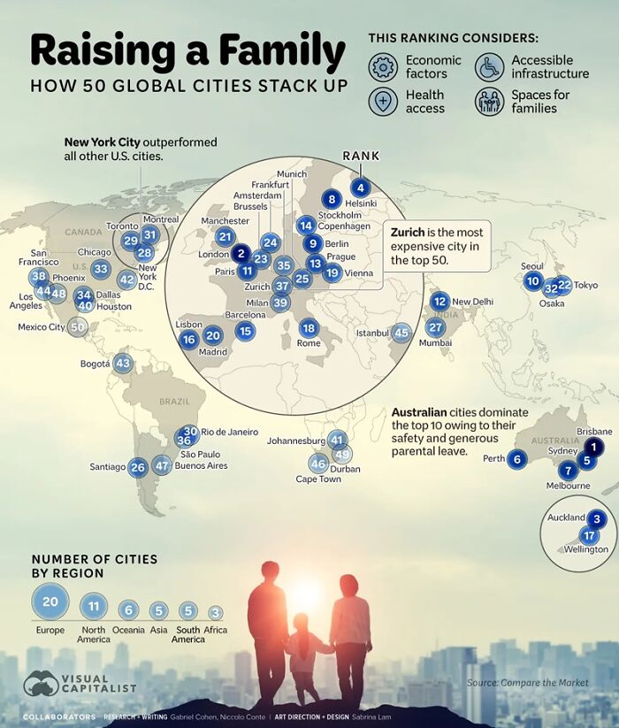
#65 How 50 Global Cities Rank For Raising A Family
© Photo: visual capitalist
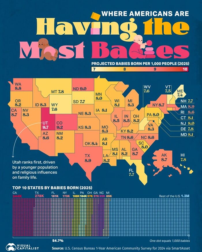
#66 Where Birth Rates Are Highest In The US
© Photo: visual capitalist
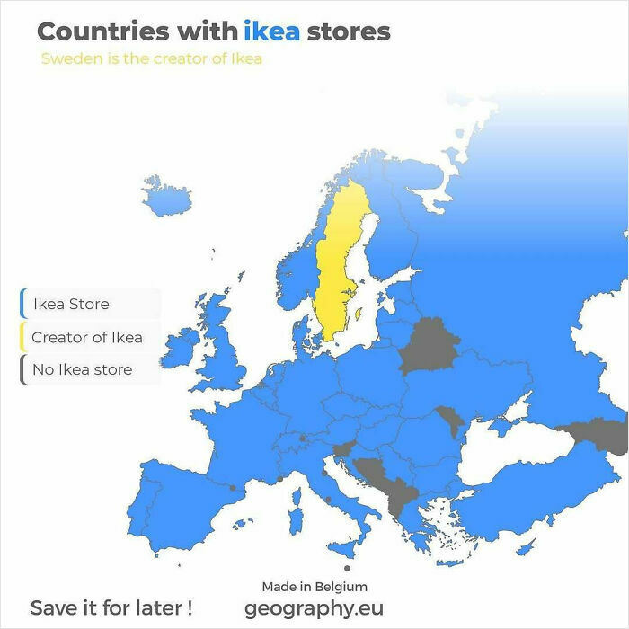
#67 Countries With IKEA Stores
© Photo: geography.eu
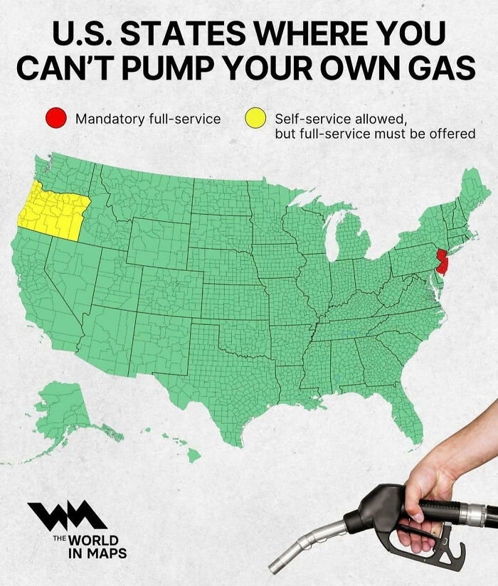
#68 US States Where You Can’t Pump Your Own Gas
© Photo: vladgrinch
#69 A Cool Guide About The 20 Best-Selling Video Game Consoles Of All-Time

© Photo: StatsPanda
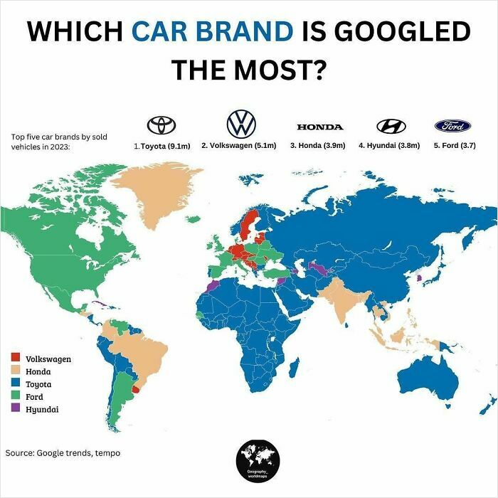
#70 Which Car Brand Is Your Favorite?
© Photo: geography_worldmaps
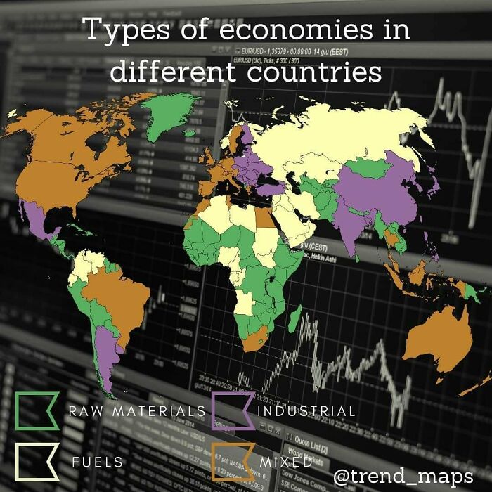
#71 Different Kinds Of Economies
© Photo: trend_maps
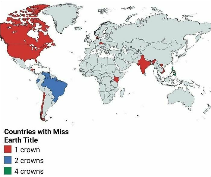
#72 Countries With Miss Earth Title
© Photo: User
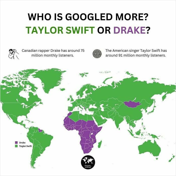
#73 Drake Or Taylor Swift?
© Photo: geography_worldmaps
You Might Also Like: Unsettling images: 25 photos that changed after a second look
Comments are closed, but trackbacks and pingbacks are open.