Creativity is one of the most important qualities a designer can have. Knowing when to dial it back is a close second. Because as strange as it sounds, design can absolutely suffer from too much imagination.
To show you what we mean, we went over to the subreddit r/DesignDesign, where people share the most hilariously impractical creations on the internet. The pieces we found are all undeniably inventive, but actually using any of them is a completely different story. Scroll down and see for yourself.
Click here & follow us for more lists, facts, and stories.
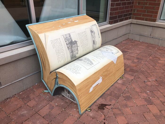
#1 This Bench Looking Like A Book
© Photo: Public-Eagle6992
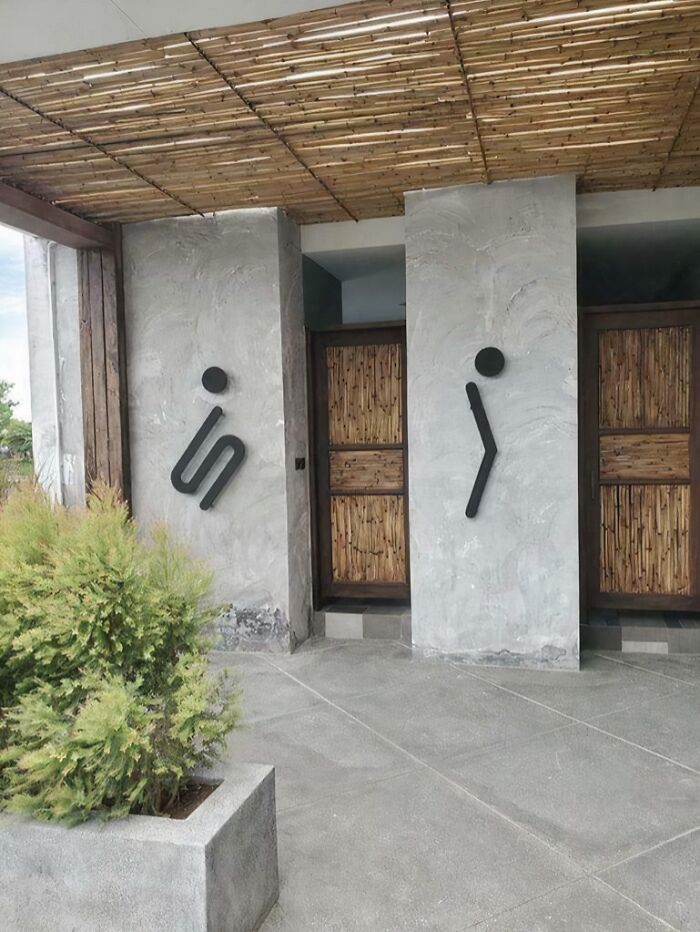
#2 This Is Probably The Funniest And Weirdest Washroom Sign
© Photo: portal742
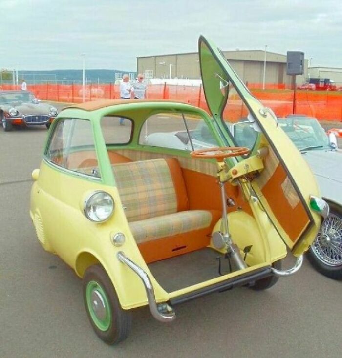
#3 1960 Bmw Isetta
© Photo: BroadCapital
We interact with design every single day, whether we realize it or not. Everything around us was created by someone with a specific purpose in mind. From the chairs we sit on to the apps we use on our phones, all of it went through some kind of design process at some point.
The thing is, that process doesn’t always lead to great results. Sometimes things come out looking a bit off, and sometimes they end up so over-the-top that they become completely unusable.
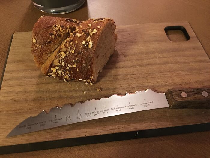
#4 This Bread Knife In A Swiss Restaurant Has A Silhouette Of The Major Peaks In Switzerland
© Photo: Independent_Log1931
#5 Panthermobile
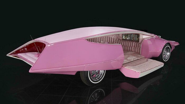
© Photo: StephenMcGannon
#6 The Look Of This Office Building
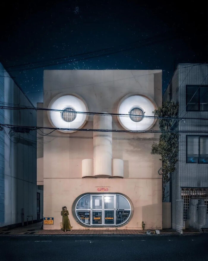
© Photo: Lepke2011
If you’re not a designer, it can be tough to explain exactly why something feels wrong. You might look at a poster on the street and be able to read everything on it, but something about it still bugs you. You know it doesn’t look right, you just can’t quite put your finger on the problem.
Well, there are actually specific principles that separate good design from bad. Robin Williams breaks down four of them in his book “The Non-Designer’s Design Book,” and they’re surprisingly easy to understand. Once you learn what they are, you start noticing them pretty much everywhere.
#7 Cat Spotlight
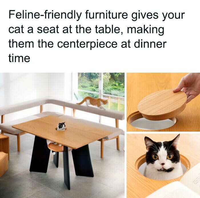
© Photo: User
#8 Local Burger Place’s Graphic Menu
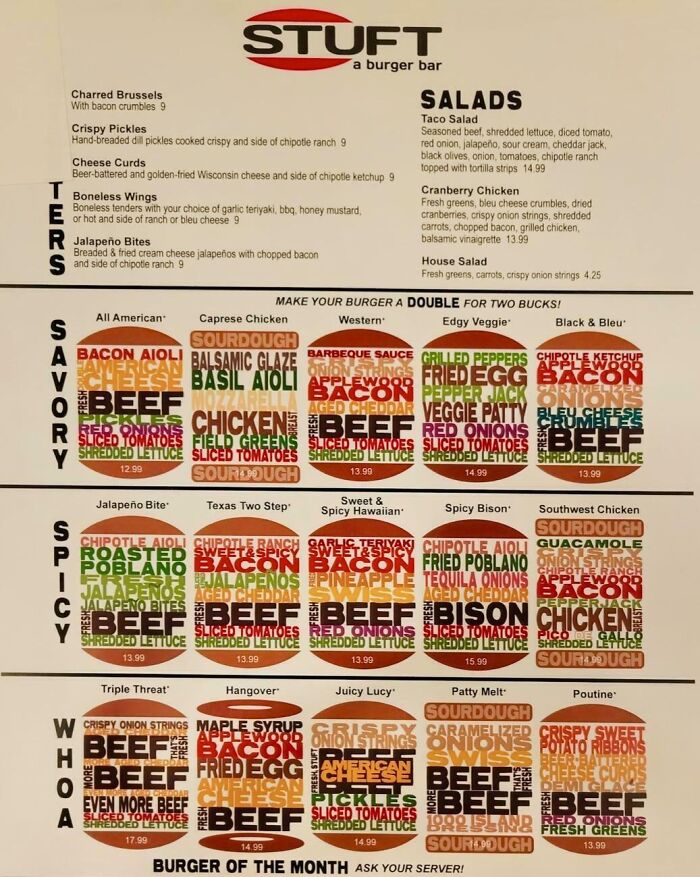
© Photo: TheWaterUser
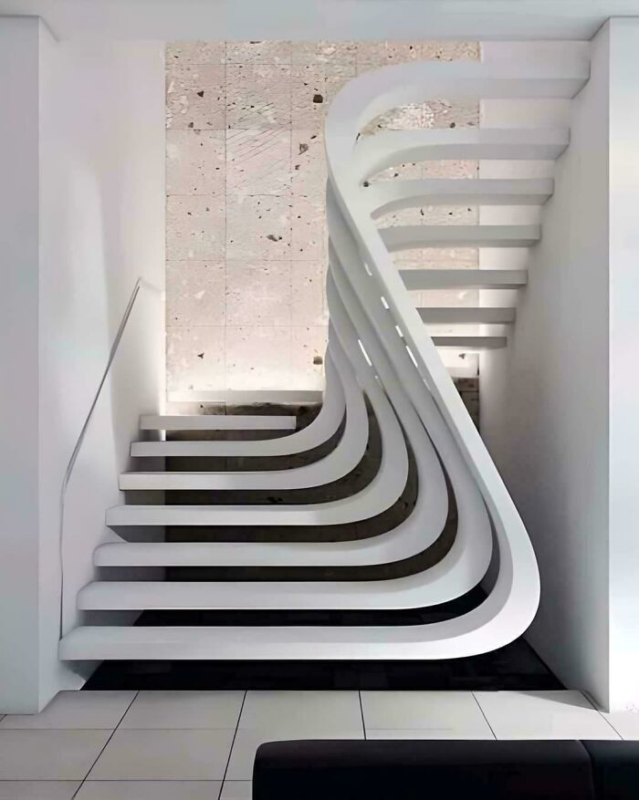
#9 Three Must Be A Reason Design People Are So Obsessed With Stairs
© Photo: User
The first one is called proximity. The idea is simple: things that belong together should be placed near each other. When related items are grouped closely, they naturally form a visual unit, which makes everything easier to process.
Think about a restaurant menu where all the information is scattered around the page with no clear grouping. Your eyes would jump all over trying to figure out what goes with what. When everything is grouped properly, you can scan through it without any confusion at all.
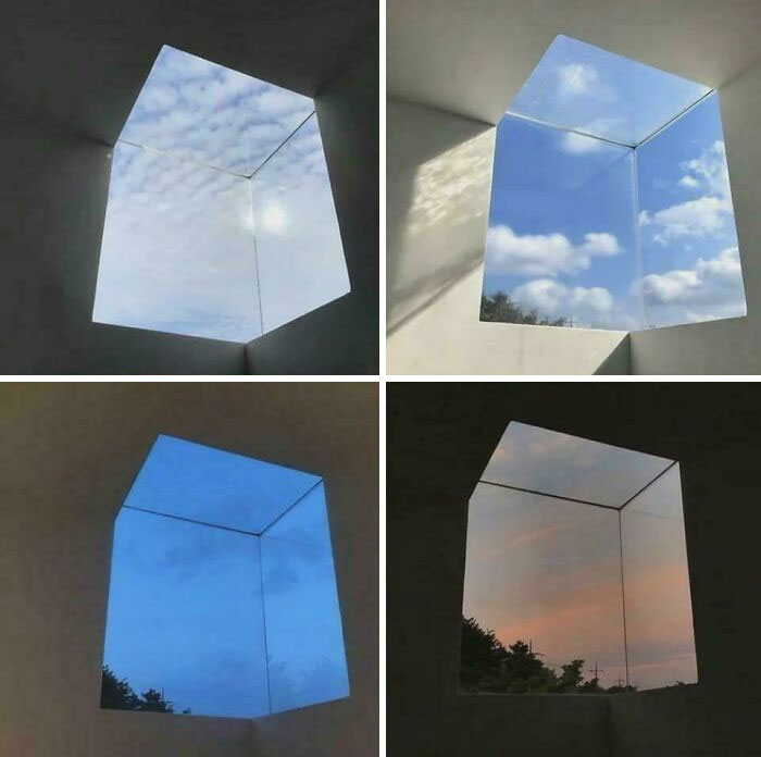
#10 These Corner Windows
© Photo: fuzzytheduckling
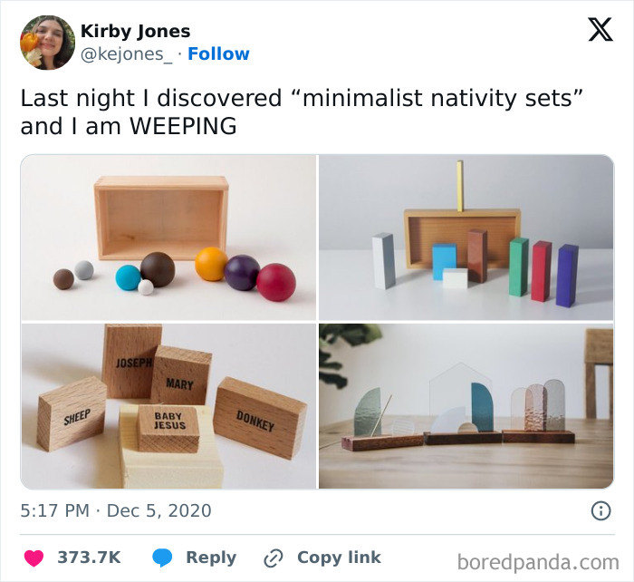
#11 Sets
© Photo: kejones_
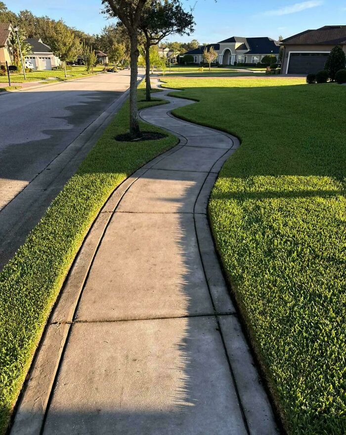
#12 This Wavy Sidewalk Is More Fun And Less Practical
© Photo: akkosetto
The next principle is alignment. Nothing on a page should feel like it was placed there randomly. Every element needs some kind of visual connection to the things around it. When items are properly aligned, even if they’re far apart, there’s an invisible line that ties them together and creates structure.
You’ve probably seen flyers or websites where the text and images seem to just be floating with no order at all. When everything lines up with intention, the whole piece instantly feels more put together.
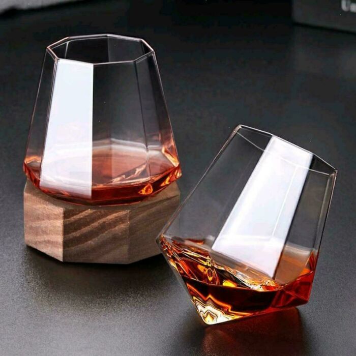
#13 This Whisky Glass
© Photo: skan76
#14 Having To Scan A Qr Code In Case Of Emergency

© Photo: User
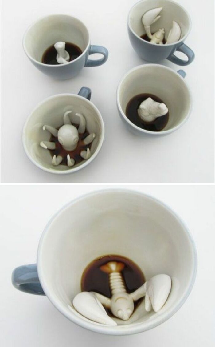
#15 Creature Cups
© Photo: PresentSecretary44
Then there’s repetition. This one means using the same visual elements consistently throughout a piece, like the same colors and fonts. It creates unity and makes everything feel like it belongs to the same family.
Imagine walking through a building where every floor has completely different signage with its own fonts and color scheme. It would feel messy and disorienting. Consistent signage throughout the whole building makes navigation easy and gives the place a much more professional feel. It also tells people that the design was done with care and thought.
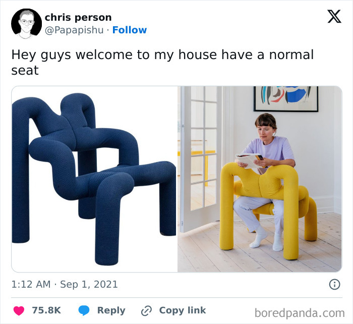
#16 Seat
© Photo: User
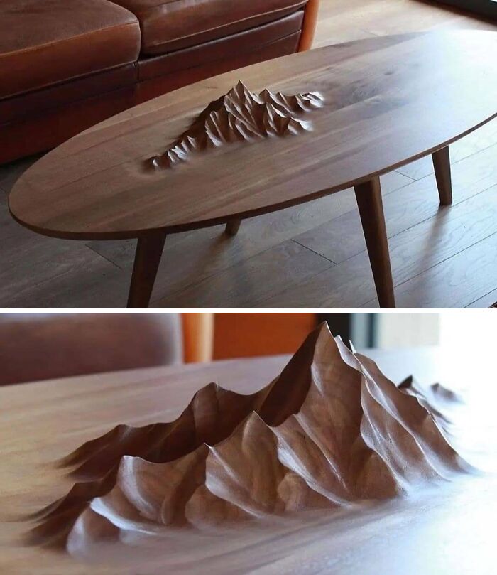
#17 Coffee Table With Bonus Mountain Range
© Photo: acidiola
#18 This Speedometer
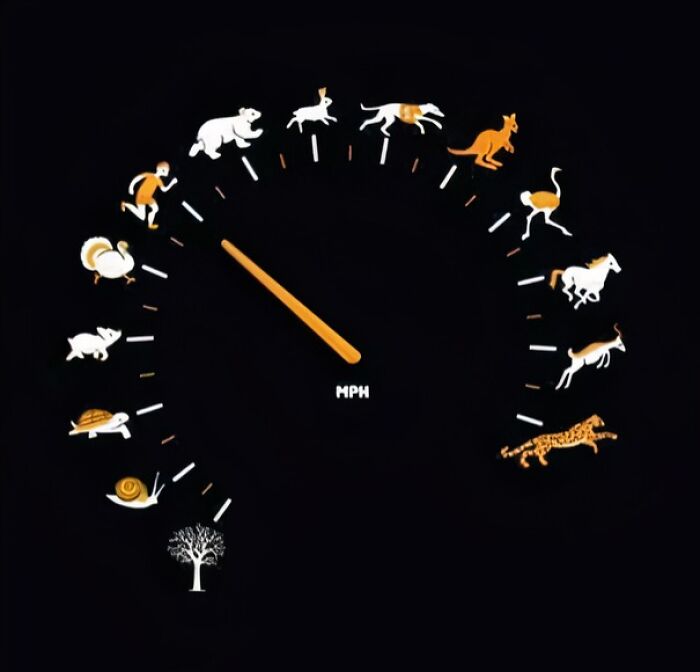
© Photo: knjiru
The last one is contrast. If two elements are supposed to be different from each other, they should be very different. Contrast is often what grabs your attention first and makes you actually want to look at something. It also helps organize information by making it clear what matters most.
Think about a remote control where every single button is the same size and color. You’d have to read the tiny label on each one just to find the volume. When the important buttons are bigger or a different color, you can find what you need instantly without even thinking about it.
#19 Cliff Cup
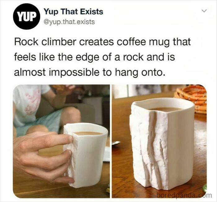
© Photo: snootyscoop
#20 Sunglasses, Mask, Face Shield
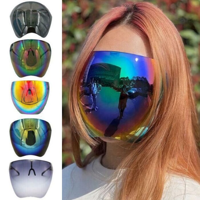
© Photo: Sufficient-Cress1958
#21 Sweater That’s Also A Backpack
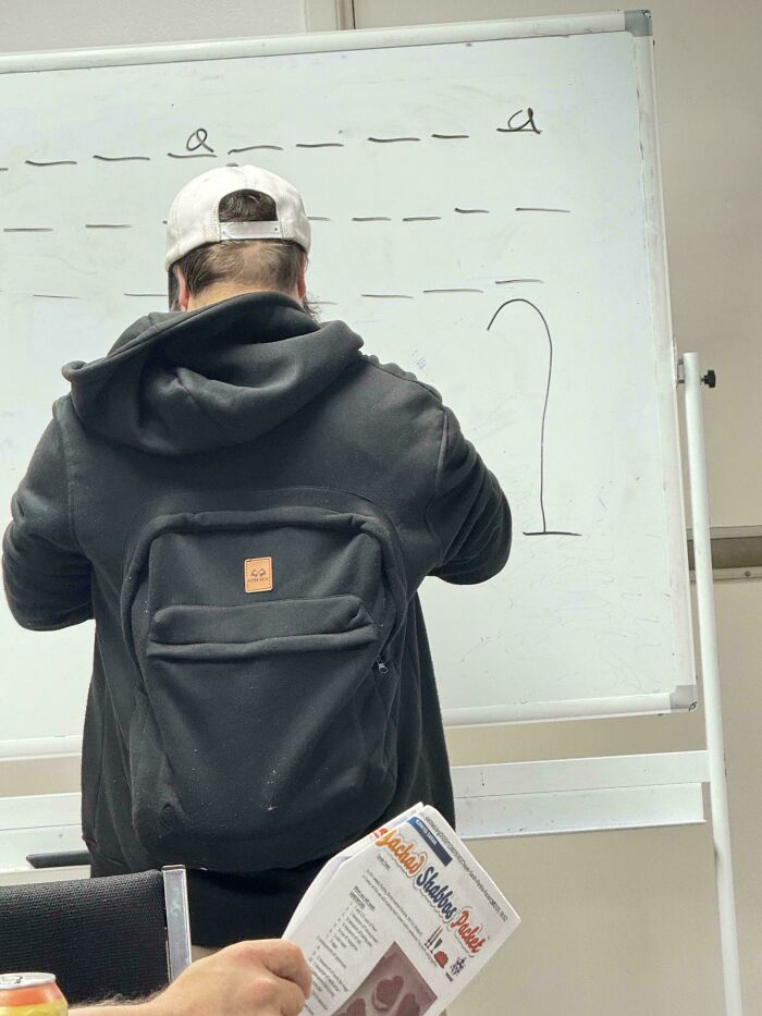
© Photo: GibsMcKormik
When you look at the over-designed creations in this list, you’ll probably notice that many of them break several of these principles at once. Sometimes the elements are spread so far apart that proximity goes completely out the window. Other times, alignment is all over the place, or there’s so much going on that nothing creates real contrast anymore.
Many of these pieces are undeniably creative on a technical level. The problem is that creativity without solid principles behind it tends to produce something that looks impressive at first glance but falls apart when you actually try to use it.
#22 What Is Even The Goal Of The Photographer Here?
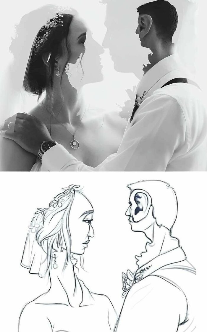
© Photo: FreddThundersen
#23 Gosh
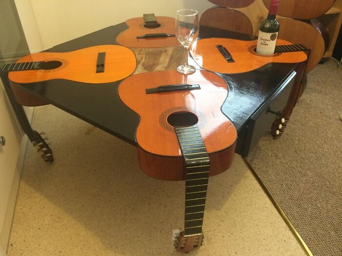
© Photo: anon
#24 Man Ray Chess Set (1926)
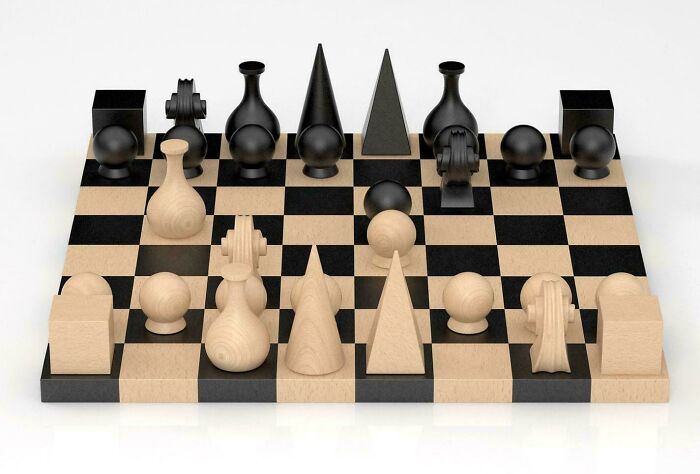
© Photo: StephenMcGannon
These four principles are far from the only ones out there. There are plenty of other guidelines and rules that go into truly good design. But proximity, alignment, repetition, and contrast give you a solid starting point for understanding why something works or why it doesn’t.
So next time you come across something that makes you tilt your head and wonder what went wrong, you’ll have a much better idea of what to look for.
#25 The Pi Bike Or Picycle
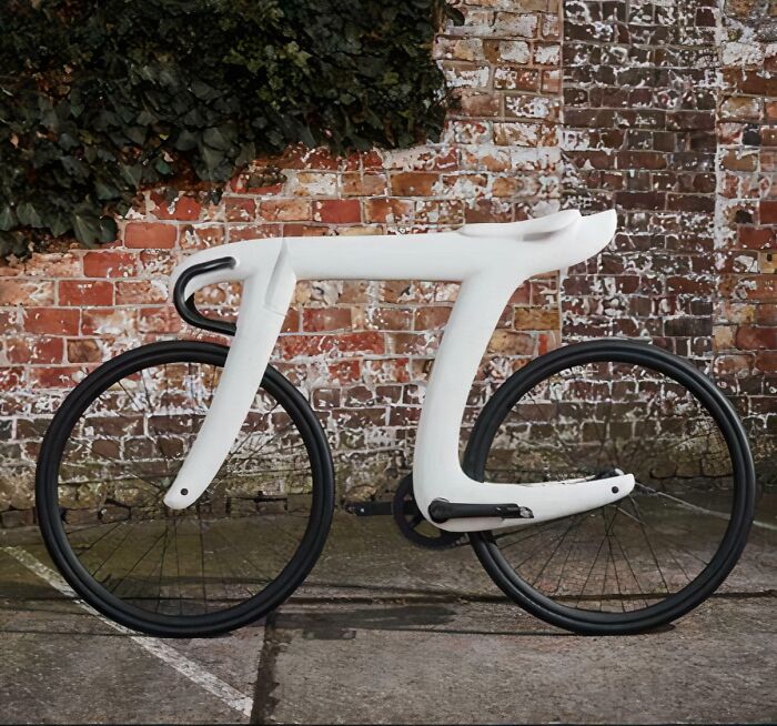
© Photo: User
#26 This Handrail
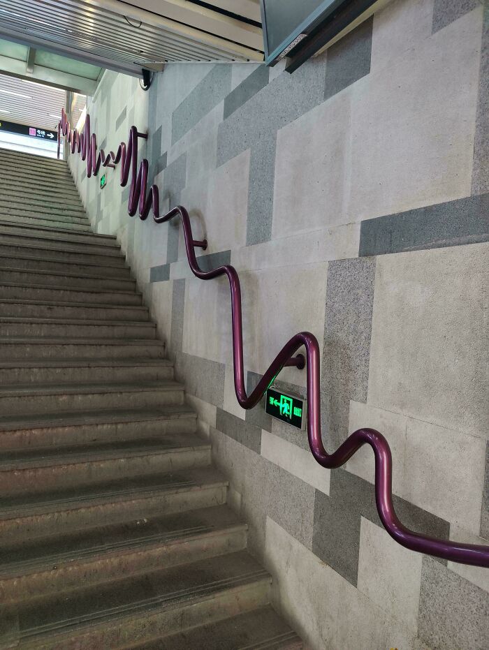
© Photo: ekkki
#27 Dangling A Toilet Above Another Toilet
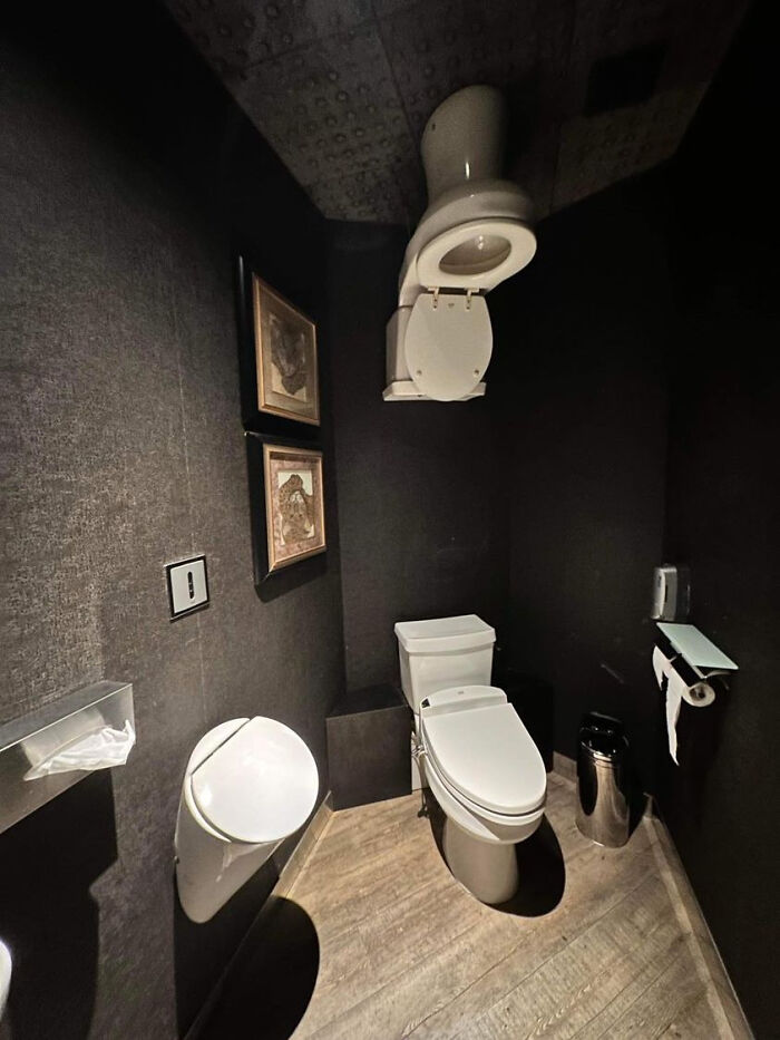
© Photo: hofong159
#28 Create A Problem, Solve The Problem, Profit!
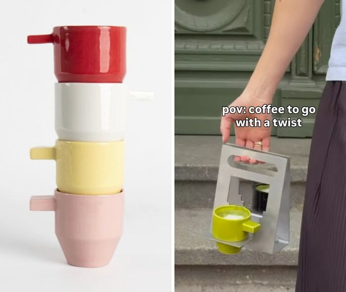
© Photo: georgmierau
#29 This Is What Happens When You Let An Architect With Too Much Free Time Loose
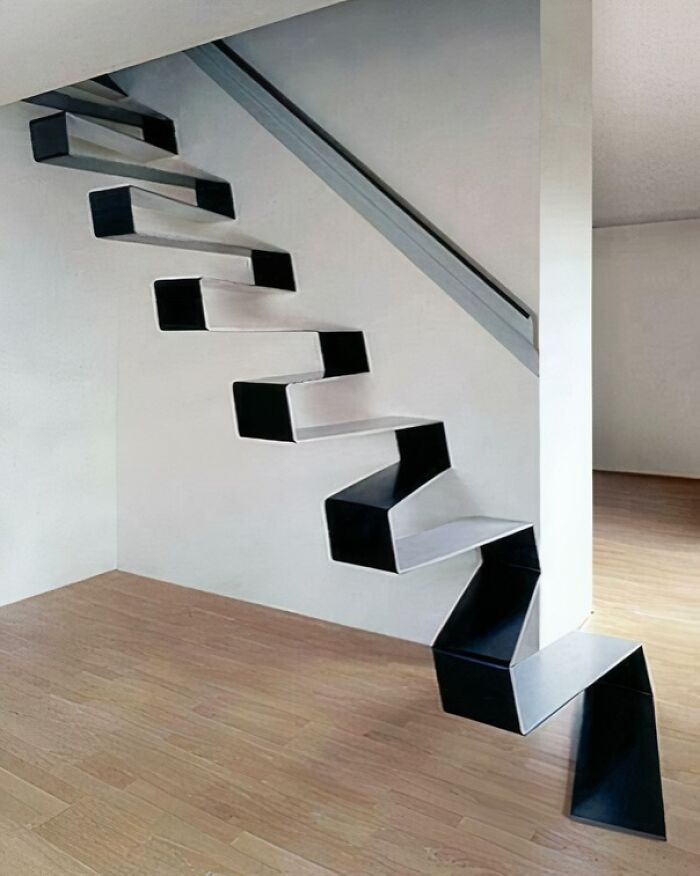
© Photo: Stephanie_Tatum
#30 Chairs In Despair
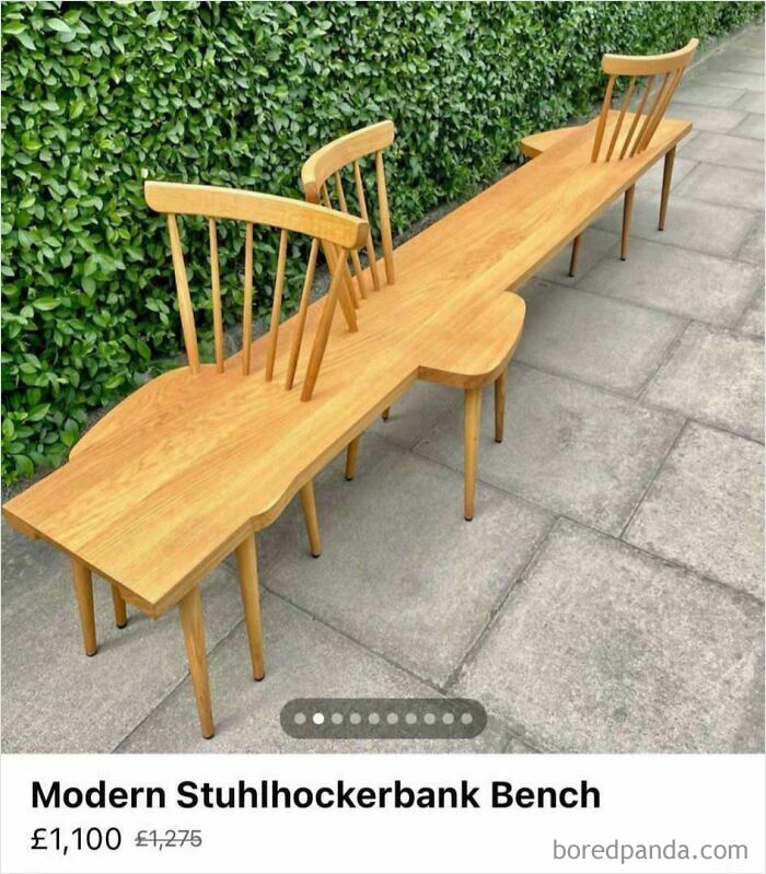
© Photo: jibcheese
#31 Bike Rack Looks Fallen Over And Only Useable On One Side
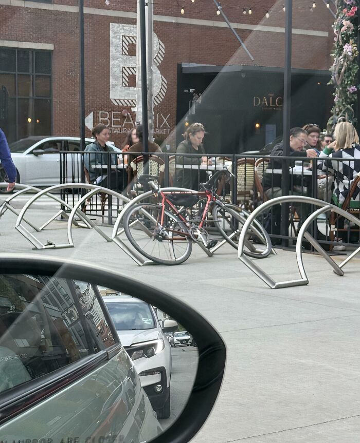
© Photo: cottoncowboy1
#32 Tp. Tpeach. Teace Peach
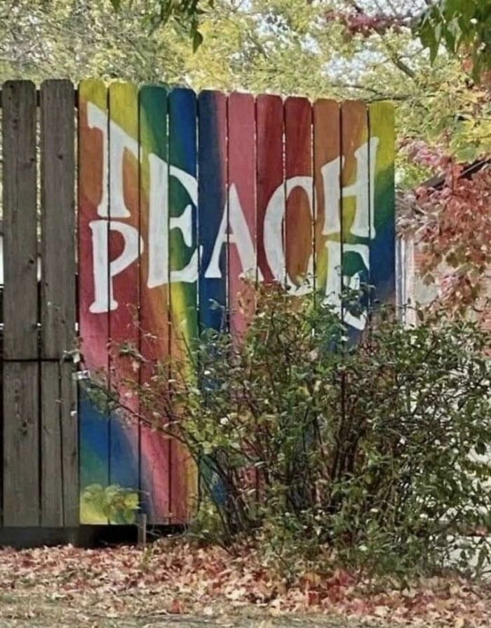
© Photo: miamylo
#33 LED Sign I Came Across On Amazon Today. 😀 Seeyouspa Cecowboy

© Photo: Iswhars
#34 This Is Supposed To Be A Bathtub
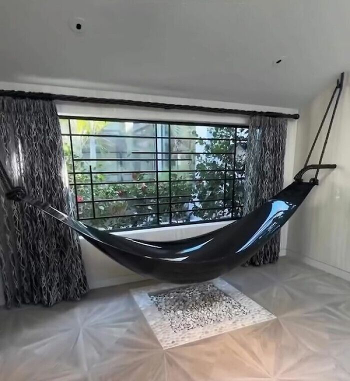
© Photo: AStrangeHorse
#35 The Entire Hotel Room Lights Up When Someone Turns On The Bathroom Light
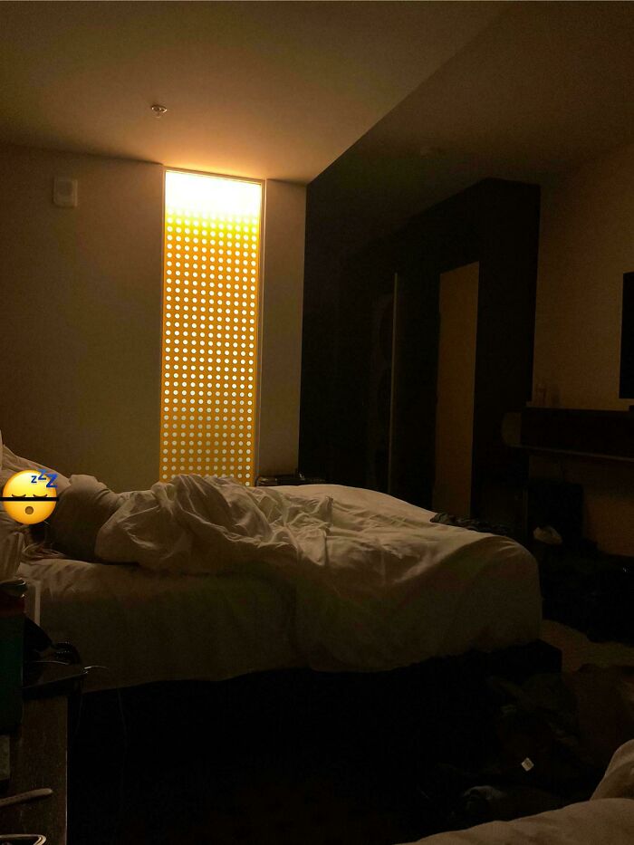
© Photo: MarchogGwyrdd
#36 The Cup I Got At A Restaurant, Yes That Is Supposed To Be The Handle, Even The Waiter Was Struggling To Hold It
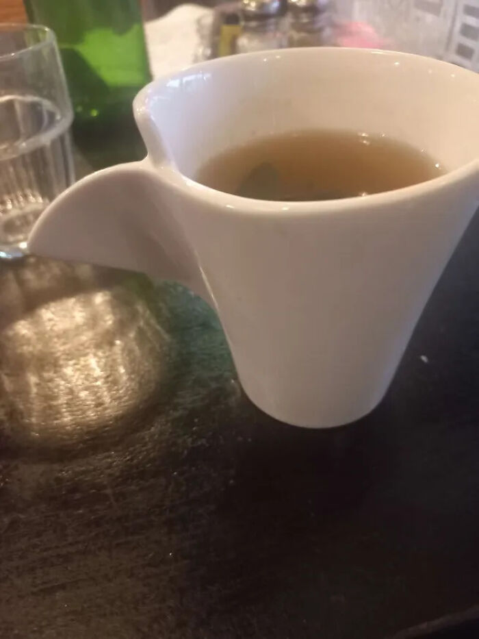
© Photo: Sowf_Paw
#37 This Teapot Is Very
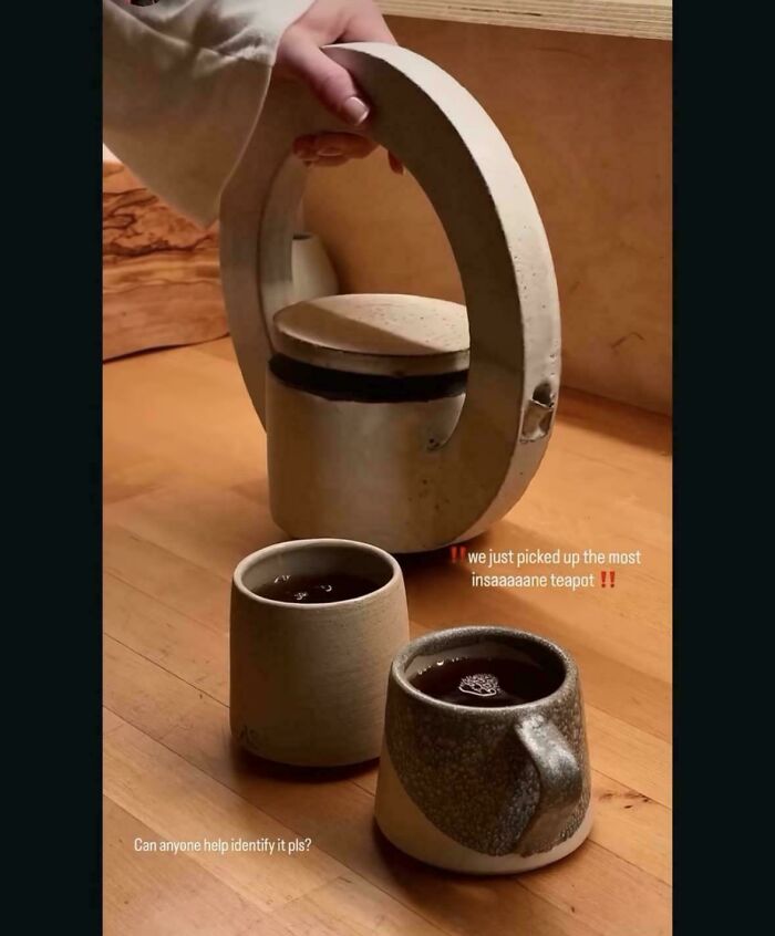
© Photo: dan_dorje
#38 Salt Lake City, Triple Decker Fireplace
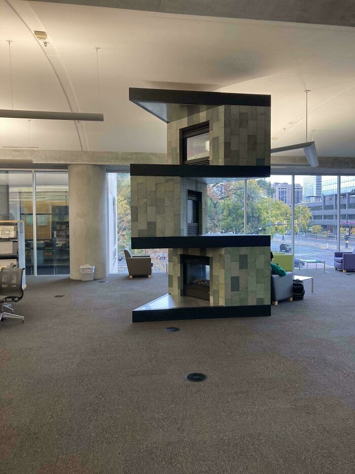
© Photo: ofivem
#39 This Bed Was Designed To Wreck My Shins At Night
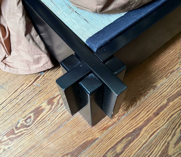
© Photo: User
#40 Because People Love Sitting On Bike Seats When They Don’t Have To
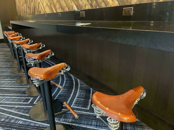
© Photo: DrLeisure
#41 Glass Sink In A Hotel
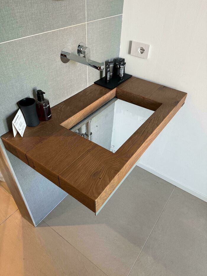
© Photo: BGDesign
#42 Bike Rack That Prioritizes Form Over Function
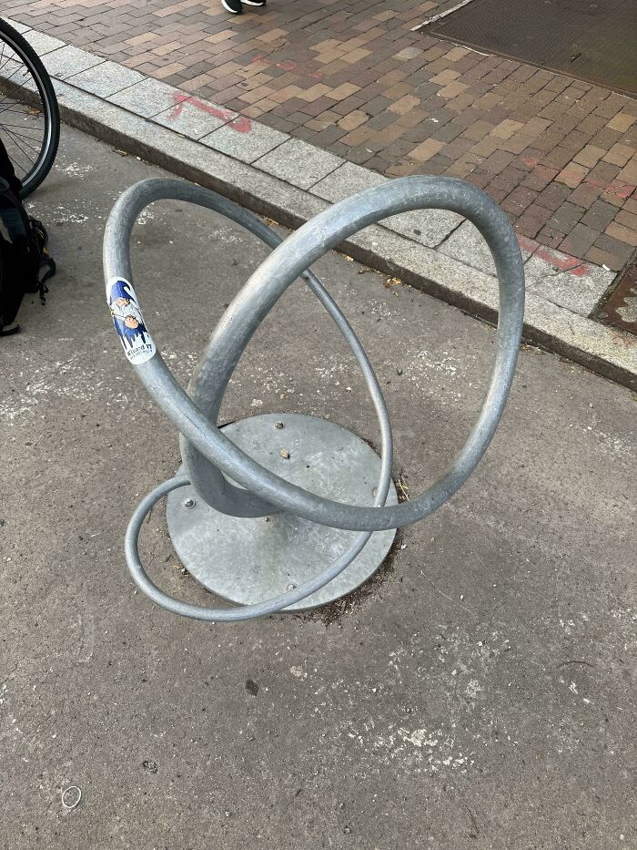
© Photo: phantomtails
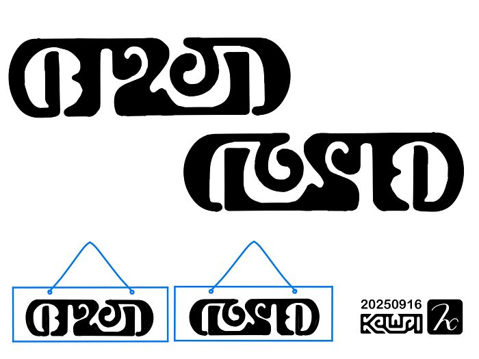
#43 Open / Closed Door Sign
© Photo: Red-42
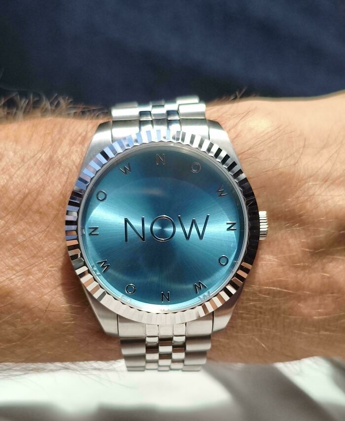
#44 A Watch That Doesn’t Tell Time, Minimal Dial Design For Mindfulness Lovers
© Photo: Fabulous-Jump-35
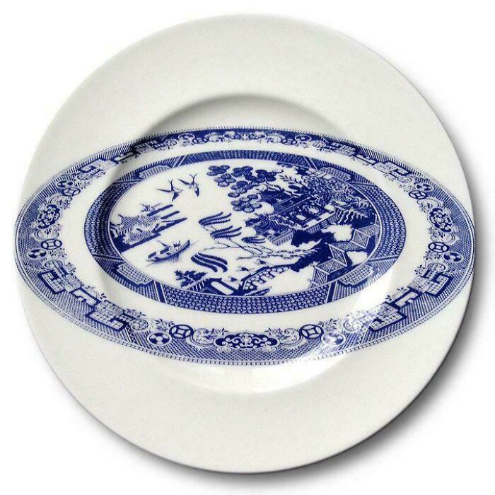
#45 Traditional Ceramic Motifs Reimagined
© Photo: Adventurous-Year-463
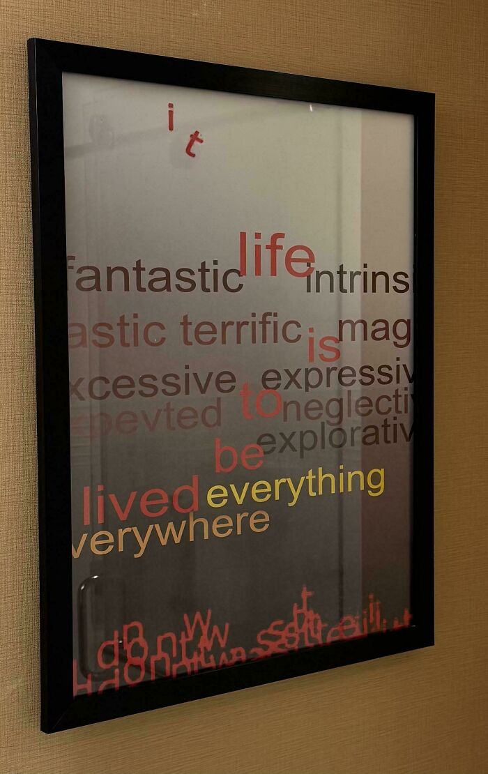
#46 This Hotel Bathroom Art Is A Little Xcessive With The Expressiv
© Photo: jvenegoknee
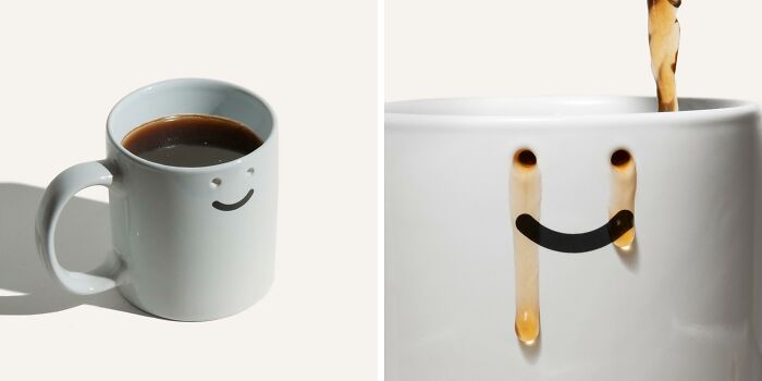
#47 Rip White Shirts
© Photo: braveNewWorldView
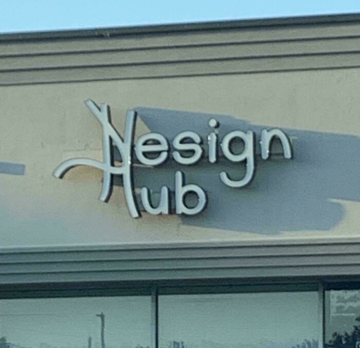
#48 It’s Got Design In The Name!
© Photo: User
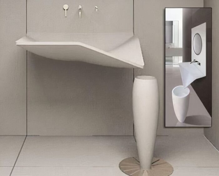
#49 A Sink That… Sinks?
© Photo: User
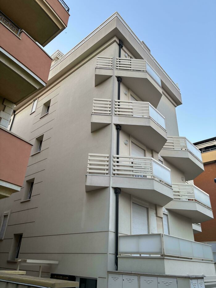
#50 A Perfectly Designed Balcony
© Photo: DasBierChef
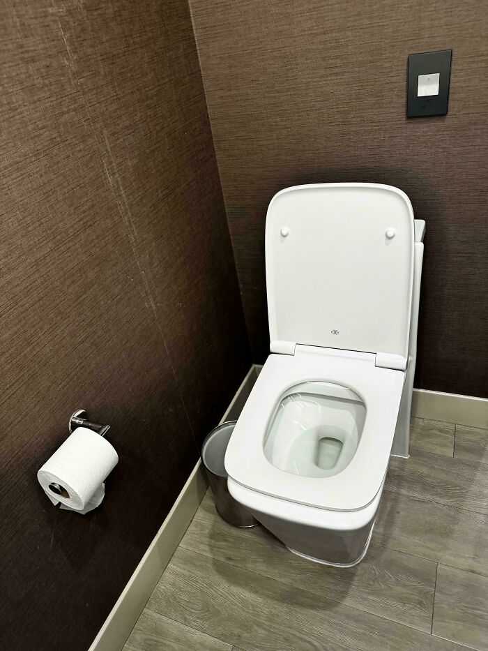
#51 Who The Heck Invented This? The Most Uncomfortable Toilet I Ever Sat On And It Was A Luxury Hotel
© Photo: mocross88
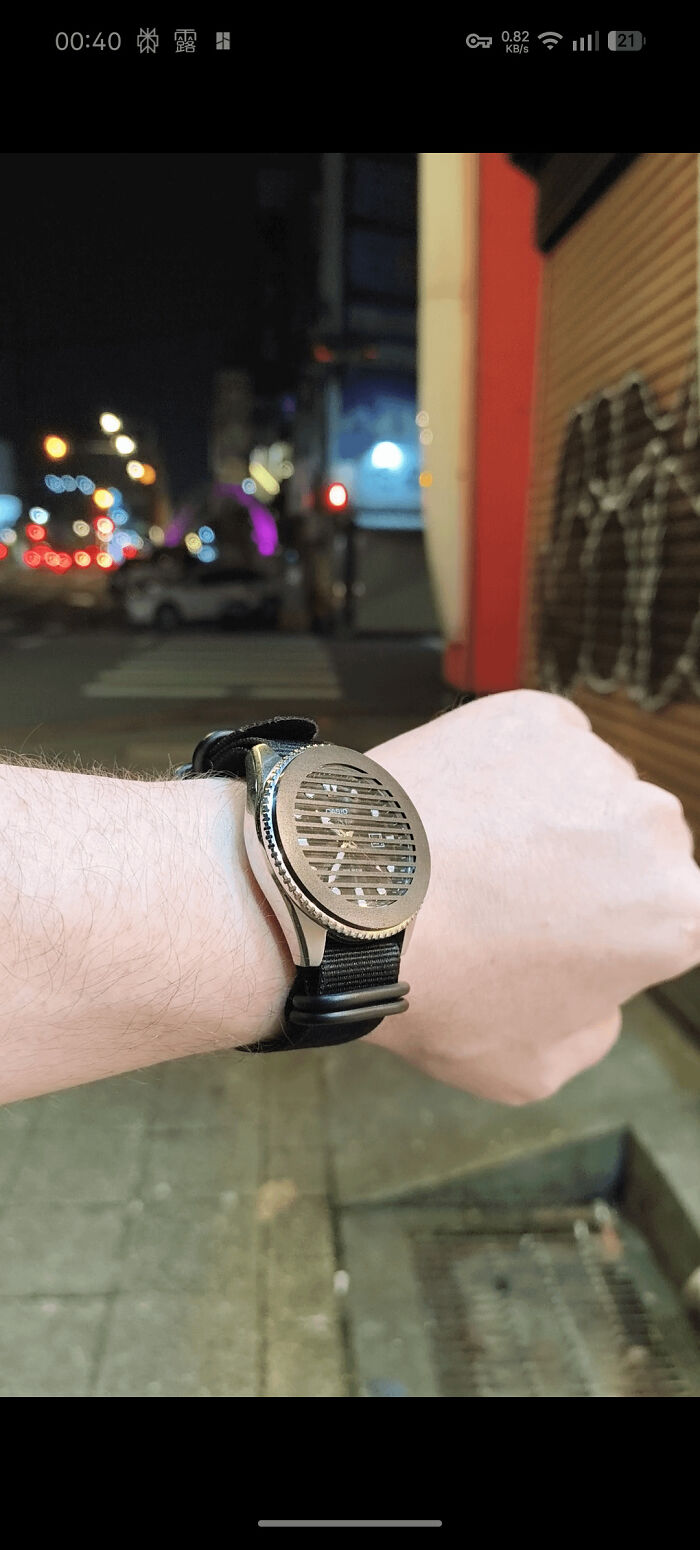
#52 The “Anti-Diver”: A Design Rejected By Both Watch Purists And Professional Designers. Form Follows Vibe
© Photo: PureRepresentative89
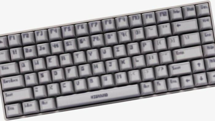
#53 This Keyboard With Blurry Keycaps Made To Look Like Early 3D Video Game Graphics
© Photo: glyph1234
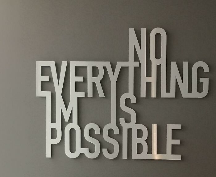
#54 What In The World Is This Supposed To Say?
© Photo: MsPaganPoetry
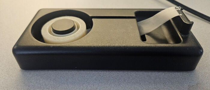
#55 It Looks Cool But Isn’t Great To Use
© Photo: User
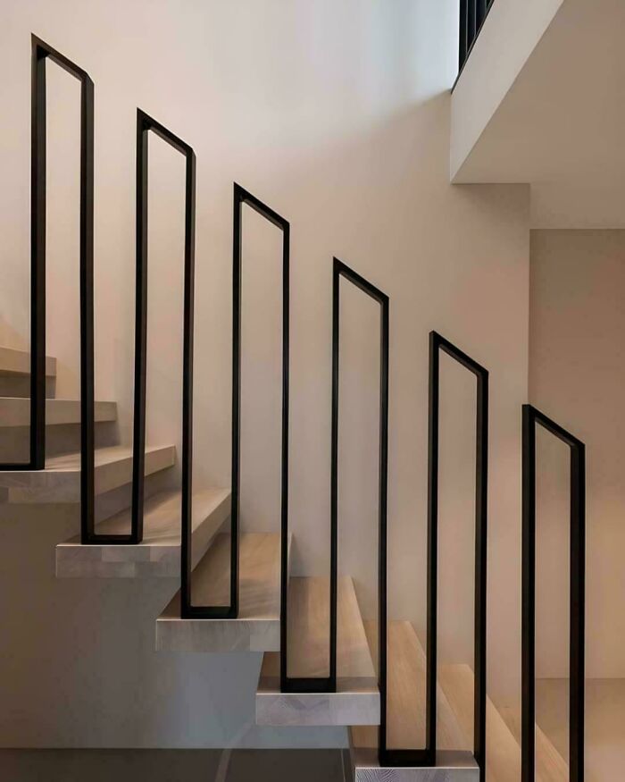
#56 Handrail With Gaps And Sharp Edges
© Photo: acidiola
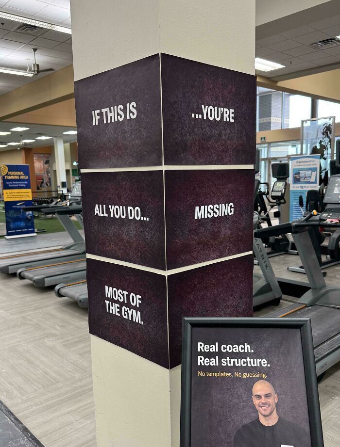
#57 An Ad Inside The Gym To Get Coaching And Structure
© Photo: ordiclic
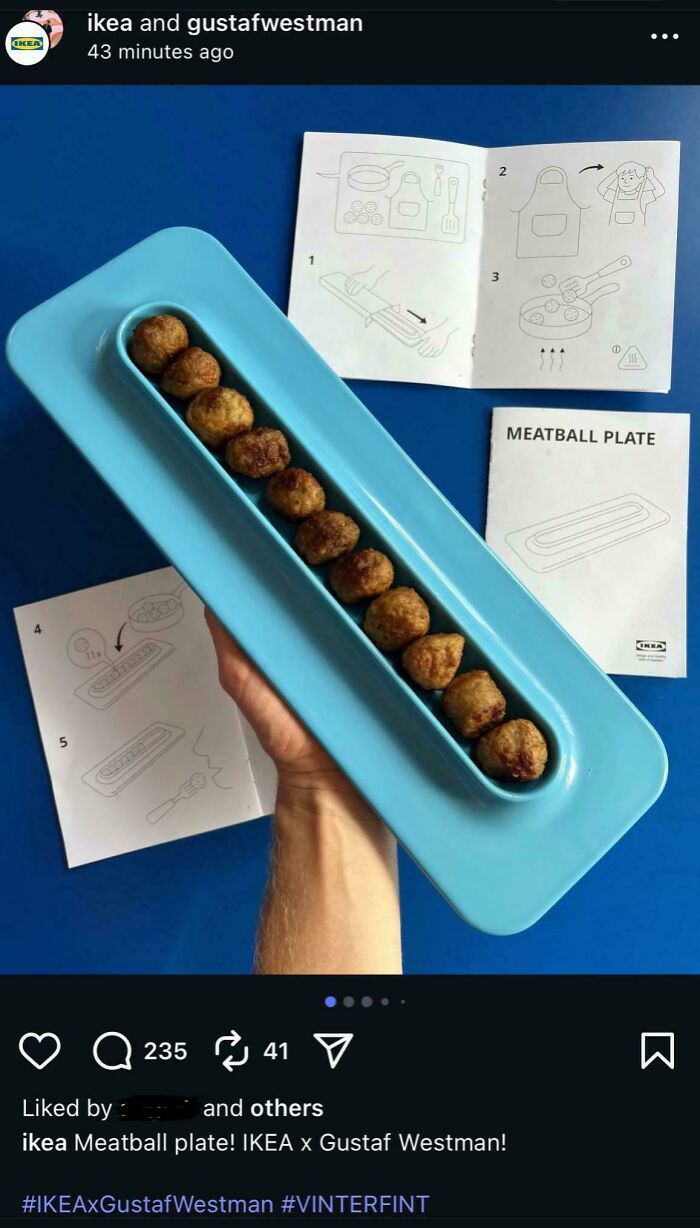
#58 Meatball Plate By Gustav Westman X IKEA
© Photo: krampaus
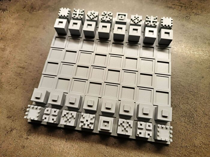
#59 Single-Color Chess
© Photo: User
You might also like: 40 smart inventions that failed because no one understood them
Comments are closed, but trackbacks and pingbacks are open.